Poorly designed website footers often lead to high bounce rates, negating all the effort and resources invested in advertising, content production, and marketing to attract visitors to your site.
If your website design falls short, potential customers are likely to leave anyway, making your advertising efforts completely worthless.
Luckily, websites have been around for a while. Many footer designs have been tried over the years, and a clear methodology has emerged for what works. The truth is that a well-designed website footer is crucial for capturing users’ attention, encouraging engagement, and ultimately driving conversions.
This article delves into the nuances of best practices for website footers. It covers what elements to include and examples of well-executed designs. Implement these guidelines in your website footers, and watch your advertising investment transform from a money pit into a conversion machine.
- What Is a Website Footer?
- Best Practices for Website Footer Design
- Essential Elements to Include in Your Website Footer
- Examples of Great Footer Designs
What Is a Website Footer?
A website footer is the section found at the bottom of every page on a website. It typically contains company details, links to important pages, social media buttons, and legal disclaimers, among other elements. Its primary function is to help visitors navigate the site, understand the business, and take desired actions.
Website footers are typically static for every web page. They act as a “catch-all” for users who found their way to the bottom of the page yet didn’t find what they were looking for.
The concept of footers originated in the early days of web design when sites were simpler, and the footer was merely a place to include copyright information. However, as the internet has matured, so have the design features of footers – now, a site footer can play a vital role in maximizing usability, increasing conversion actions, and even boosting SEO rankings.
The Importance of a Website Footer
A website footer serves multiple purposes, contributing significantly to a better user experience, conversion rate optimization, improved site navigation, a professional image, and enhanced SEO indexing.
Professional Image
First and foremost, a footer makes your site look professional. Sites with no footer sections look incomplete and amateur. Footers add a degree of professionalism to a site, showing that your business pays attention to all aspects of your online presence, even the seemingly minor details.
User Experience
Good website design makes it easy for users to navigate and find what they want. When a website is hard to navigate, it creates “user friction” and makes users leave. A well-designed footer can provide quick access to vital information, making the user journey smooth and efficient. It can also host important links, making navigation effortless and intuitive.
Conversion Rate Optimization
In addition to easy navigation, a website footer contributes to conversion rate optimization. Most websites have an intended goal for users to take. In digital marketing, this intended action is called a conversion. A conversion could be a phone call, a sale, a contact form submission, a newsletter signup, or really any intended business goal.
The conversion rate is the proportion of website visitors that take a conversion action when visiting your site. It tells you how well your site converts users into qualified leads. As such, the conversion rate is one of the most important website metrics to track.
Users are encouraged to convert through calls-to-action, where you explicitly tell the user what action they should take. While some users will convert before scrolling to the bottom of the page, others will not. This is where a footer section can act as a “catch-all” and allow users to convert before bouncing.
Search Engine Optimization
A footer can be an instrumental part of SEO indexing. Site crawlers, which examine web pages for search engine indexing, look at site structure to determine page and link hierarchy – the most important pages get indexed. A well-structured footer indicates which pages are priorities and helps site crawlers index the site while ranking priority pages higher.
Another SEO ranking factor is user engagement. Search engines measure user behaviour once a user enters a site. One such usability metric is session engagement. Session engagement is measured by how many pages a user visits in a session before leaving the site. Ideally, a user will click through to a site from a search engine and visit multiple pages. This indicates to the search engine that the user’s search intent was satisfied and reinforces the page’s rank for that keyword.
Finally, a footer section can contribute to a site’s expertise, authoritativeness and trustworthiness (EAT) – general factors that Google uses to determine a site’s ranking potential.
Now that we know why a website footer is so important for a website, let’s take a look at website footer best practices.
Best Practices for Website Footer Design
Website footers can come in various shapes and sizes. While you can play loose with some design features, every website footer should have these elements:
Consistency
Make sure your website footer aligns with the rest of your website’s design. This includes maintaining consistency in colours, fonts, and style throughout the page.
Instead of appearing disconnected from the rest of the site, it should create a seamless visual flow. Because the footer is on every page, you want it to look tight to leave a lasting impression on your site visitors.
Responsiveness
Modern websites need to be responsive for mobile. Mobile internet traffic made up 60% of total web traffic in 2022. If you have a mobile-friendly site, your user engagement will improve.
Your site’s footer section should arrange list items and icons into a tidy mobile version. If you have lots of list items, consider turning them into drop-down menu items so it doesn’t look cluttered.
Ultimately, all elements of good footer design should transfer between all screen sizes – from desktop to tablet to mobile.
Simplicity
The KISS (keep it stupid, simple) principle applies to website footer design. People seek a clear, easy path to find what they want. When you try to include too many links, widgets, icons, or text, you risk confusing the user and making them bounce.
Instead, include just enough to help the user navigate the site, but nothing more. Clean, utilitarian footer designs win over gaudy, overcrowded designs.
Visibility
In line with simplicity, ensure all footer elements are highly visible and easy to interact with. Text and link colours should be highly contrasted with the background colours – this means either dark backgrounds with light colours or light backgrounds with dark colours.
Make sure that no elements are overlapping and that they all have adequate padding between them. Watch out for menus and other dynamic elements that can bump into each other and make for poor user experience.
Remember, people look to site footers to find what they need quickly and easily.
Usefulness
One of the primary purposes of a website footer is to guide visitors to the information they need. Therefore, link labels in the footer must be clear and accurately represent the content they lead to.
Ambiguous or misleading link labels can lead to confusion and frustration, potentially driving users away from your site. Instead, opt for concise and descriptive labels that clearly indicate what users can expect when they click on a link.
This improves user experience and contributes to conversion rate optimization and user engagement.
Essential Elements to Include in Your Website Footer
Everything in your website footer should serve a purpose. There should be no excess. Here are the items you should include in your design to create an effective and user-friendly website footer:
Company Info
Including company information in the website footer helps to cement your brand identity and foster trust with site visitors. The name and logo provide immediate recognition, creating a link between your brand and the content on the site.
An ‘About’ subheading concisely introduces your brand, its mission, and its values. Showcasing a few awards and accreditations can elevate your brand’s credibility.
By displaying these elements prominently in the footer, you ensure they are visible on every page, reinforcing your brand identity throughout the user’s browsing experience.
Navigation Links
These are links to critical sections of your website, such as the Home page, About Us, Contact Us, and others. Including navigation links in your footer improves navigation and makes it easier for users to explore your site.
Any priority pages such as service pages should be arranged in their own column. This gives users an easy access point to your “money-making” pages and boosts conversion rates.
Social Media Icons
Links to your social media profiles enable users to interact with your brand on various platforms. This can increase your brand’s reach and visibility and foster a sense of community and engagement among your audience.
The footer section is a great place to link to social media because it doesn’t take up valuable real estate at the top of the page or in the main site navigation.
PRO TIP: If you have a highly active and visual Instagram page, you can share your feed in the footer section to help convert some website visitors into Instagram followers. Depending on your website content management system (CMS), you should be able to share your feed with a simple widget. For example, building your website with WordPress CMS allows maximum flexibility for widgets in your footer section.
Legal Information
This includes your privacy policy, terms of service, and copyright notice. Displaying this information in your footer not only complies with legal standards but also builds trust by informing visitors about how their information is used and protected.
Call to Action (CTA)
A clear and compelling CTA in your footer can guide users toward a specific action, such as signing up for a newsletter or downloading an ebook. This can help increase conversions, grow your subscriber base, and drive engagement.
CTAs can take the form of buttons, contact form submissions, or call tracking phone numbers. Make sure you make your CTAs prominent so there’s no confusion about what the user should do next.
By creating a comprehensive resource for information in the footer section, you can facilitate navigation, foster engagement, establish trust, and ultimately, drive your online business objectives forward.
Examples of Great Footer Designs
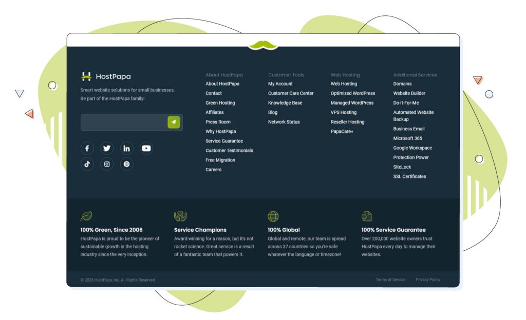
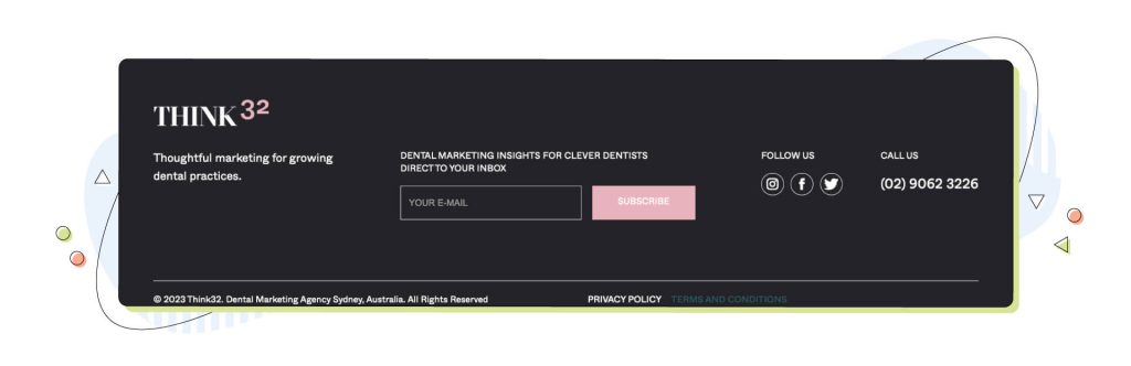
1. Think32
This dental web design agency really nailed it with their website footer. They have good contrast between the white text and the dark background. A clear colour theme is established, consistent with the rest of their site design. Their company profile is prominently displayed on the left with a logo and a catchphrase. The best parts about it are the strong calls-to-action with the click-to-call phone number and the newsletter subscription box.
2. WPBeginner
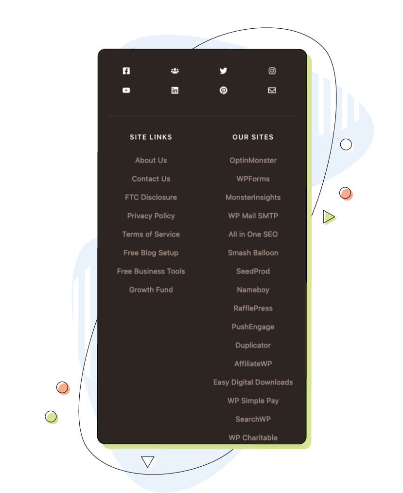
WPBeginner nails its website footer with its well-organized site links. Each column fits nicely in separate sections, making it simple to browse and navigate. The “Featured In” company icons lend social proof to the site without overcrowding.
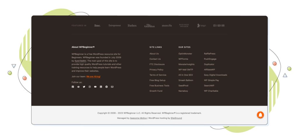
When you switch to mobile, the responsive design reorganizes the site links and the social icons nicely, creating a seamless browsing experience.
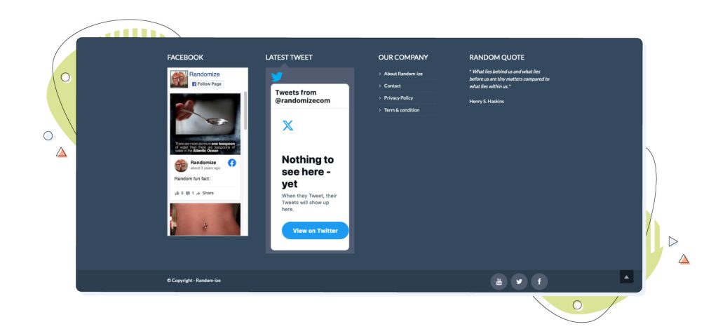
3. Randomize
Randomize, a random web result generator, utilizes social media streams well. Their website footer features a Facebook and X stream, which creates intrigue and engagement amongst website visitors.
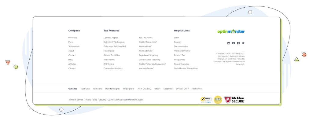
4. OptinMonster
OptinMonster, the popular conversion optimization company, does a great job of organizing a lengthy list of site links and establishing credibility with security icons. The “Top Features” column provides easy access to the site’s product pages. These links will contribute to both conversions and SEO rankings by driving traffic to priority pages.
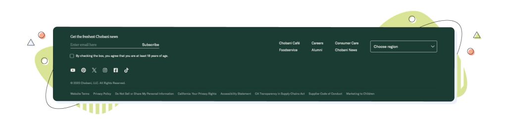
5. Chobani
Chobani prioritizes important legal information in its simple yet effective website footer section. All legal information is listed clearly at the bottom in a sleek layout. The newsletter call-to-action on the left prioritizes one conversion action, so users have no confusion about what to do next.
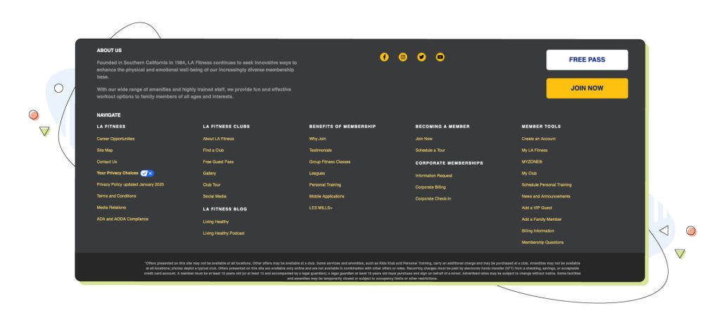
6. LA Fitness
The LA Fitness website footer passes the design test with flying colours. While it features a long list of site links, LA Fitness managed to assemble a five-column design with elegance. Other elements that make this footer design work are having a consistent colour scheme and a good contrast between the text and background.
However, this creates a very dull result, and you’ll need more. One great way to make it more engaging is adding large call-to-action buttons and a small “About us” section.
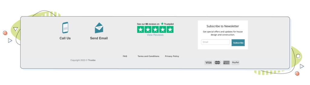
7. Truoba
The modern home design company Truoba utilizes a slim and concise footer section to great effect. Three calls-to-action are displayed with click-to-call and click-to-email icons, plus a simple newsletter opt-in form. Truoba leverages its impressive Trustpilot average review rating to establish authoritativeness and trustworthiness.
Conclusion: Footers Matter!
A website footer is a crucial part of every website. The footer could make the difference between an amateur-looking mess and a professional, well-polished website. Follow the guidelines in this article, and you’ll be well on your way to providing a useful resource that helps users get around your site.
Don’t leave your users to fend for themselves. Put some thought into intentional footer design – contribute to your brand identity, conversion rates, SEO, and engagement. And if you’re in need of a reliable web host, consider HostPapa’s fast and secure options for your brand new website. Of all the robust options, it’s guaranteed that you’ll find the one that covers all your needs.
Author Bio
Matt Nawrot is a serial entrepreneur and digital marketing aficionado with a passion for helping others run successful online businesses. You can connect with him here at MattNawrot.com.