All websites have menus. Some are better. You need an excellent navigational menu for website development. It’s one of the most important elements on your website because it affects the most important outcomes.
And if those top two factors weren’t enough, your website navigation menu affects virtually every other success factor of your website. Little choices have a significant impact on your results, especially in the areas where a thorough plan is crucial.
In this blog post, we’ll dive deep into nine best practices for website navigation that can improve your user engagement and conversions.
- Importance of Website Navigation
- 9 Best Practices for Website Navigation
- Types of Website Navigation Structure
Importance of Website Navigation
Navigating a website should be a seamless experience for users. Website navigation can greatly impact the success of a website, as it directly affects a user’s ability to find what they are looking for.
A well-structured navigation menu can help users quickly locate the information they need, decreasing the chances of frustration and abandoning the website. Clear, concise labels and familiar placement of navigation elements can increase user confidence in navigating the site and finding what they need.
Good navigation also helps with search engine optimization, making it easier for search engines to crawl and index your site.
In short, website navigation is key to creating an enjoyable user experience and achieving increased engagement and conversions.
9 Best Practices for Website Navigation
1. Keep Navigation Labels Short and Descriptive
Navigation labels serve as signposts, guiding users around your website. Thus, they need to be easy to understand and give users a clear indication of what they can expect to find when they click on them.
Labels should be short, preferably no more than two or three words. But while keeping them short, you must ensure they remain descriptive and meaningful. Using common, familiar words can help users quickly understand what each section is about, enhancing the overall usability of your website.
Moreover, align your labels with the keywords users might use in search engines. This can improve your site’s SEO, making it easier for potential visitors to find your website in the first place.
2. Use Visual Cues
Visual cues are a powerful tool for guiding user navigation on your website. These cues, such as colours, shapes, icons, images, arrows, or even whitespace, can help users understand how to interact with your site.
For example,
An arrow can point to the important call-to-action button, or a colour change can indicate a hover or clicked state of a navigation item. Icons used consistently can also help users understand the functions of different elements faster.
However, be mindful to keep visual cues intuitive and not overuse them, which can lead to a cluttered and confusing interface.
3. Break Down Navigation Into Categories
For websites with vast amounts of content, breaking down navigation into categories can significantly improve the user experience. Categorization helps to structure the information, making it easier for users to find what they are looking for.
When creating categories, group related items together and label them with a term that accurately reflects the content. These category labels then serve as the top-level navigation items, leading users to more specific content within that category.
This not only streamlines your navigation but also helps users get a sense of what content is available on your site at a glance.
4. Avoid Visual Clutter
While it’s important to provide users with all the necessary navigational elements, bombarding them with too much information can lead to visual clutter, making your website look overwhelming and confusing. Strive for a balance between functionality and aesthetics.
Whitespace, also known as negative space, is your ally here. It gives your design room to breathe, separates different sections, and emphasizes important elements.
Simplify your design by eliminating unnecessary elements or information and using clean, readable fonts.
Remember, less is often more in website design.
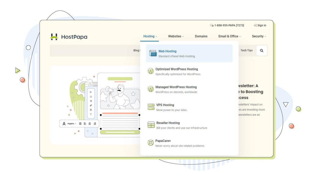
5. Utilize Dropdowns
Dropdown menus can be useful for managing complex navigation systems without overwhelming the user. They allow you to hide secondary navigation items until users hover over or click on a primary item, keeping your navigation clean and focused.
However, it’s important to use dropdown menus wisely. Make sure they’re easy to use, with large enough touch targets for mobile users. Also, avoid multi-level dropdowns, which can be difficult to navigate and may frustrate users.
6. Add Search Functionality
As mentioned before, a user-friendly search function can greatly enhance the navigability of your website, especially if it’s content-rich. It offers an alternative way to navigate, allowing users to bypass the structured menu and directly find what they’re looking for.
A search box should be easily identifiable and accessible from every page, typically placed at the top of the site.
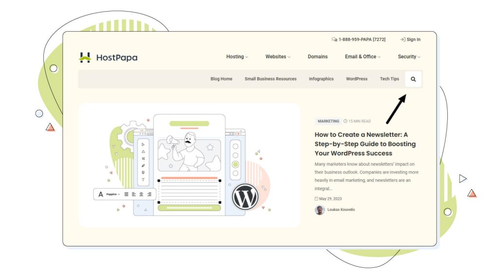
To enhance its functionality, consider adding features like autocomplete, search suggestions, spelling auto-correct, and filters.
7. Use Breadcrumbs
Breadcrumbs are an excellent navigational tool that can significantly enhance the user experience on your website, especially if it has a deep or complex structure. They provide a trail for the user to follow back to the starting or entry point, showing users their location within your website’s hierarchy.
Breadcrumbs take the form of a horizontal list of links, usually placed at the top of a page beneath the primary navigation. They indicate the user’s current location relative to the site’s hierarchy simply and intuitively.
When implementing breadcrumbs, it’s essential to keep them simple and consistent. They should begin with ‘Home’ and follow the structure of your website.
The current page, which is the last element of the breadcrumb, is usually presented differently (in different colours or unlinked) to indicate that it’s the page the user is currently viewing.
Remember that breadcrumbs can enhance navigation, but they should not replace primary navigation. Users should still have access to the main navigation menu from all pages.
Breadcrumbs simply serve as a complementary navigation tool to improve usability and provide context to users.
8. Clarity and Simplicity
When it comes to effective navigation, clarity and simplicity take center stage. It’s all about minimizing cognitive load – the amount of mental processing power needed to use your website. Overloading your navigation bar with many options can confuse users, slow their decision-making process, and ultimately lead to frustration.
To achieve clarity, limit your main navigation to the most important high-level categories, typically around 5 to 7. Be concise and precise with your language.
For simplicity,
Consider a clean, straightforward design that avoids unnecessary elements. This doesn’t mean you can’t have multiple layers of navigation, but they should be organized logically. If you have a complex site with many sections, consider using drop-down menus or mega menus that neatly categorize options without overwhelming the user.
The key is to facilitate your users reaching their destination as quickly and effortlessly as possible.
9. Prioritizing Items Based on User Needs
User-centred design is the backbone of good website navigation. You need to understand your users’ needs, preferences, and behaviours and prioritize navigation items based on these insights.
Website analytics can provide invaluable data on user behaviour, such as the most visited pages or the common pathways users take. Heatmaps can visually show you where users are clicking the most. Armed with these insights, you can prioritize the content that matters most to your users in your navigation, thus improving the overall user experience.
Use the upper fold of your website wisely. It’s prime real estate, so place the most important or frequently accessed items there.
Remember, the ultimate goal is to align your navigation with the user’s goals, enabling them to complete their tasks with minimal clicks and effort.
Types of Website Navigation Structure
I’ll break down some different forms of navigation. You have no restrictions on these options, but they generally exist on most sites. Ideally, this format should be retained so users understand how to proceed.
1. Primary Navigation:
2. Secondary Navigation:
This type of navigation appears below the primary navigation bar and usually contains additional relevant options to a particular page or section.
3. Internal Links:
These appear in the body content of web pages and link to other pages within the website, allowing users to navigate without using the main navigation menu.
4. Footer Navigation:
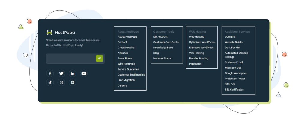
A footer typically contains links to important information such as contact info, privacy policy, and terms & conditions. It can also contain some secondary navigation options.
What is Sub-Navigation on a Website?
Sub-navigation, or local navigation, allows a user to access low levels in a web page’s navigation system. They are generally subcategories in a navigation link’s main navigation section.
The main navigation bar lists the items for navigation support. This is a useful option because visitors can quickly find their desired item.
What Should be Included in Your Website Navigation Bar?
Because your website has so much content, it’s hard to determine which pages will be useful in all the navigation systems. For SEO or user experience, OrbitMedia recommends limiting your search to a maximum of six items if needed.
What are the Benefits of Good Website Navigation?
A well-organized website can help increase user satisfaction with a particular service and improve site performance. This makes it easier to locate the content they want easily and lessens confusion, as well as improving the visitor’s general impression of the site.
Effective navigation increases website visitors’ visits and improves conversions by reducing bounce rates. The best navigation will help the website be more accessible to users, thus improving accessibility.
Conclusion
Website navigation is not just about helping users get around your website. It plays a crucial role in shaping their experience and your relationship with them.
Prioritizing clarity, simplicity, consistency, and user needs in your navigation can dramatically enhance user engagement and conversions.
Ready to improve your website’s navigation? Start implementing these best practices today!
 | Md Alinoor is a website designer and SEO content marketer. He launched his blog to teach bloggers and small business owners how to make their websites without having to learn code. You can follow him on Linkedin, Instagram, and Facebook. |


