Your website homepage is doing one of two things right now: it’s either pulling visitors in and turning them into customers, or it’s quietly sending them somewhere else. There’s rarely a middle ground. The good news? A well-designed homepage isn’t the result of luck or an enormous budget; it’s the result of understanding a handful of timeless design principles and applying them with purpose.
In this article, we’ll go over how you can create a website homepage that captivates your visitors and helps you get more conversions. We’ll cover everything you need to know, including homepage design, web page technical considerations, landing page basics, and other vital homepage elements.
- What Is a Website Homepage & Why It Matters
- Understand Your Audience & Homepage Goals
- Homepage Layout: Essential Sections & Structure
- Above‑the‑Fold Homepage Design: First Impressions That Convert
- Craft a Clear Value Proposition & Headline
- Design Navigation & Menus for Easy Discovery
- Use Visual Design, Images & Branding Consistently
- Write Homepage Copy That Guides Visitors
- Add Social Proof & Trust Signals
- Optimize Homepage Performance, Speed & Mobile Experience
- Secure Hosting Is Your Homepage Foundation
- Homepage Design Examples & Ideas for Small Businesses
What Is a Website Homepage & Why It Matters
Tim Berners-Lee, a British scientist, invented the World Wide Web (WWW) in 1989 while working at CERN. The web was originally conceived and developed to meet the demand for automated information-sharing between scientists in universities and institutes around the world. Lee created the very first website homepage, a simple document outlining his project. Web design has come a long way since then.
Think of your own homepage as the front door to your business. Before anyone sees your products, reads your blog, or fills out a contact form, they walk through that door, and first impressions form in milliseconds. Research finds that users make snap judgments about a site’s purpose within half a second of landing on it, which means your homepage has almost no time at all to make its case.
The Purpose of a Well-Designed Homepage
A homepage isn’t just decorative. It serves a series of critical functions that ripple through every visitor interaction. The best homepage design examples:
- Orient new visitors by signaling who you are and what you do.
- Communicate your value proposition so people immediately understand why they should stick around.
- Guides users toward the most important next steps, whether that’s making a purchase, booking a call, or exploring other pages.
- Builds trust, the kind of quiet, subconscious confidence that makes a potential customer feel safe enough to hand over their email address or credit card number.
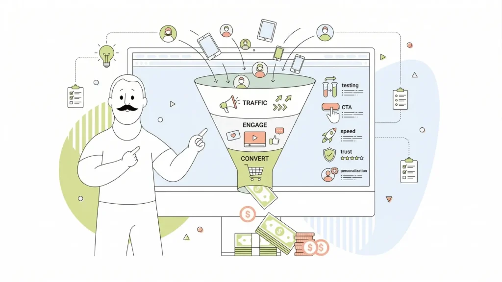
Get the homepage right, and it becomes one of the hardest-working assets in your business. Leads come in more consistently. Sales conversions climb. Visitors leave with a stronger sense of what your brand stands for. Get it wrong, and you’re essentially paying for advertising to send people to a dead end. The stakes are real, which is why it’s worth taking the time to get every element of your homepage working in harmony.

Understand Your Audience & Homepage Goals
Before you design a single pixel or write a single line of homepage copy, you need to answer one question: What do you actually want this page to do? It sounds obvious, but a surprising number of small business owners skip this step and end up with a homepage that tries to do everything and ends up doing nothing particularly well.
Establishing Homepage Goals
Your homepage goals should map directly to your business model. If you run a service business, your primary goal might be to book consultations or capture leads. If you sell products, it’s driving people toward your shop or flagship product. If you’re a local business, like a restaurant or salon, it might be getting visitors to call, book, or find your location. Clarity here shapes every decision that follows, from your headline to the placement of your call to action.
Knowing Your Audience
Equally important is understanding who’s actually landing on your homepage. Most homepages receive a mix of visitor types:
- People who have never heard of you and are evaluating whether you’re legit.
- Warm leads who’ve been referred by someone or clicked an ad and are close to deciding.
- Existing customers who need to find something specific.
A good homepage strategy accounts for all three. Here’s a simple framework to start with: write down the top two or three things a first-time visitor needs to understand immediately, the single most important action you want them to take, and how you’ll know whether the page is working (metrics like time on page, bounce rate, and conversion rate). That’s your homepage success checklist, and everything you build should serve those goals.
Homepage Layout: Essential Sections & Structure
A homepage should tell a carefully ordered story. The best homepage designs follow a logical hierarchy that guides visitors from “who are you?” at the top to “here’s why you can trust us” at the bottom, with plenty of compelling reasons to act somewhere in between.
The Breakdown of a Strong Website Homepage
Here’s how a well-structured homepage typically breaks down.
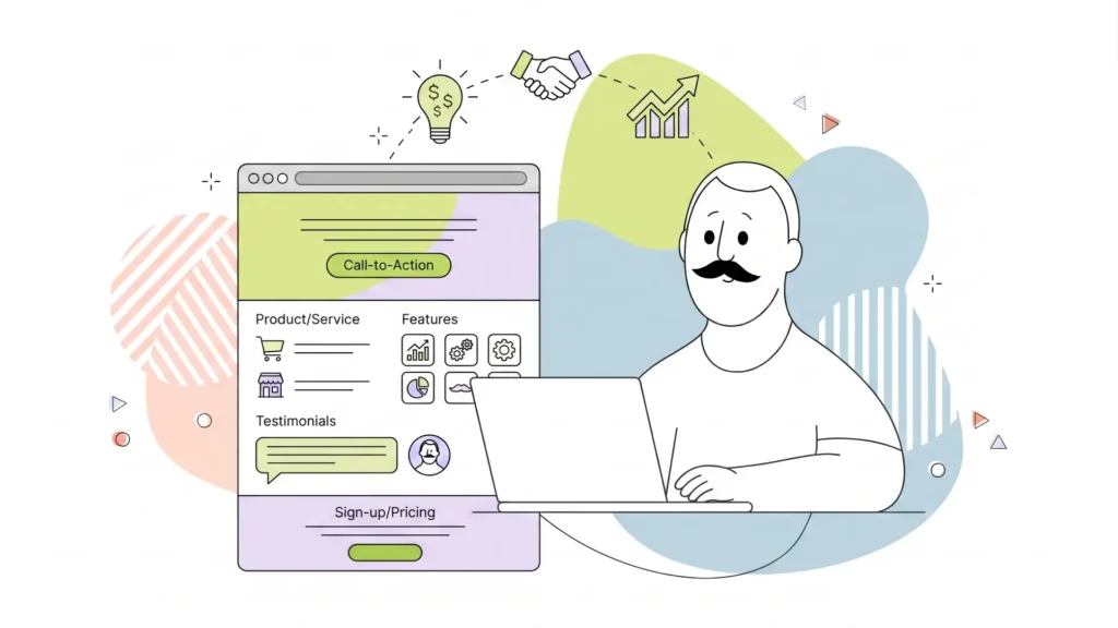
At the very top, your header and navigation give visitors their bearings. Below that, the hero section, the large visual area above the fold, which delivers your headline, subheading, and primary CTA. Next come your key benefits or features, which explain why what you offer matters. Social proof (testimonials, customer logos, ratings) serves to validate your claims. Then, content previews or featured services give visitors a taste of what else the site contains. Finally, the footer ties everything together with secondary navigation, contact info, and legal links.
This isn’t arbitrary. It mirrors the natural way people tend to process information: start with context, evaluate the offer, seek reassurance, then act. Trying to force social proof before you’ve established what you do, for example, is a bit like a sales rep leading with references before explaining what they’re selling.
Using Intuitive Navigation on Your Homepage
Your homepage design layout needs to account for how people actually read on the web, which is mostly scanning. People tend to skim down the left side of a page, dart across when something catches their eye, and skip large blocks of unbroken text entirely. That means clear headings, generous white space between sections, and a visual hierarchy that makes it immediately obvious what’s most important. A cluttered homepage doesn’t just look bad; it actively makes it harder for visitors to find what they need.
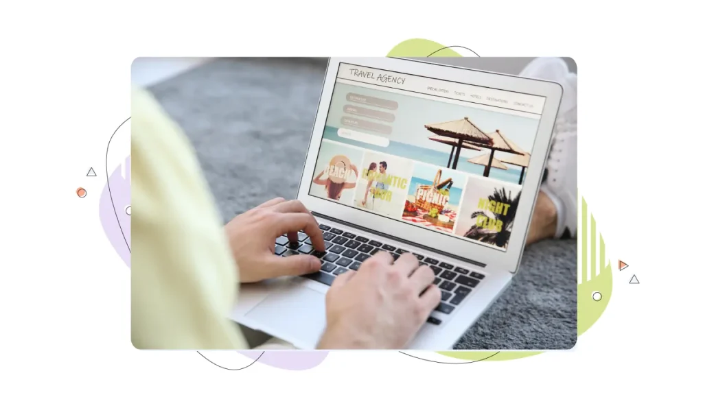
Above‑the‑Fold Homepage Design: First Impressions That Convert
“Above the fold” is a term borrowed from newspaper publishing; it refers to whatever a visitor sees before they scroll. On modern devices, that varies quite a bit. On a large desktop monitor, you have generous vertical real estate. On mobile devices, that window shrinks considerably. But the principle stays the same: the very first thing visitors see needs to be clear, compelling, and give them a reason to keep going.
The Importance of a Good Hero Section
Your hero section is where the first impression lives. A strong hero typically includes:
- A bold, direct headline that communicates what you do.
- Subheading that adds a bit more context or speaks to a key benefit.
- Prominent primary CTA button that tells visitors exactly what to do next.
- Supporting visual, whether that’s a hero image, a product shot, or a short video, that reinforces the message without competing with it.
The biggest trap with hero sections is trying to pack too much in. A hero that has three headlines, four CTAs, an animated background, and a chat popup launching simultaneously doesn’t convert well because it overwhelms visitors rather than orienting them. When in doubt, edit down.
A few practical tips:
- Keep your hero image or video optimized so the page loads fast; a stunning visual that takes four seconds to appear does more harm than good.
- Make sure your headline is readable on every screen size, including small smartphones.
- Test your hero on real mobile devices, not just a browser window you’ve resized, because behaviour on mobile devices often surprises even experienced designers.

Craft a Clear Value Proposition & Headline
If you could only improve one element of your homepage, make it the headline. The homepage headline is the single piece of copy with the highest impact per word on the entire page. It’s what visitors read first, what they use to decide whether to keep reading, and what sticks in memory if they leave and come back.
What Is a Value Proposition?
A value proposition is simply a clear statement of what you offer, who it’s for, and why it’s better than the alternative. It doesn’t need to be poetic. It needs to be specific and true. Vague headlines like “We help businesses grow” or “Solutions for the modern world” tell visitors almost nothing and are instantly forgettable. Specific headlines like “Bookkeeping software built for freelancers who hate spreadsheets” work because they speak directly to a target audience and address real pain points.
Value Proposition Templates that Form a Strong First Impression
A few formulas that work well for homepage headlines:
- “[What you do] for [who you serve]” is clean and direct.
- “[Big outcome] without [common obstacle]” speaks to pain points.
- “[Specific result] in [timeframe]” works well for service businesses.
Your subheading can then add a layer of detail, an extra sentence or two that elaborates on the promise or pre-empts a key question.
The best advice? Write ten headlines before committing to one. Share them with someone in your target audience and see which one lands. Then, once the page is live, test different messages using A/B testing tools to see what your actual visitors respond to. Your homepage headline is never truly finished; it’s always a working hypothesis.
Design Navigation & Menus for Easy Discovery
Homepage navigation is one of those things that visitors only really notice when it’s broken. Good navigation is invisible; people find what they’re looking for effortlessly and move on. Bad navigation creates friction, confusion, and exits.
Keep Your Homepage Design Simple
The golden rule is simplicity. Limit your top-level menu to five or six items at most, using labels that are genuinely descriptive rather than clever. “Services” tells visitors exactly what they’ll find. “What We Do” is slightly vague. “Our Journey” in place of “About” is a creative choice that mostly just confuses people. When in doubt, clarity beats cleverness every time.
Your header should also include a visible primary CTA, a button, not just a link, that reflects the most important action you want visitors to take. This could be “Get a Quote,” “Start Free Trial,” or “Book a Table.” Having a clear call to action in the navigation means it’s accessible from any scroll position without cluttering the hero.

Don’t Neglect Mobile-Specific Navigation Design Elements
For mobile navigation, the hamburger menu (those three horizontal lines) has become so universally understood that it’s the obvious choice for collapsing menus on small screens. Pair that with a sticky header that stays visible as visitors scroll, and you ensure that key links and your CTA are always within reach.
And don’t forget accessibility basics:
- Make sure links have clear focus states.
- Navigation is keyboard-navigable.
- Menu text has sufficient colour contrast.
Good homepage usability means working for everyone, not just users on fast connections with perfect eyesight.
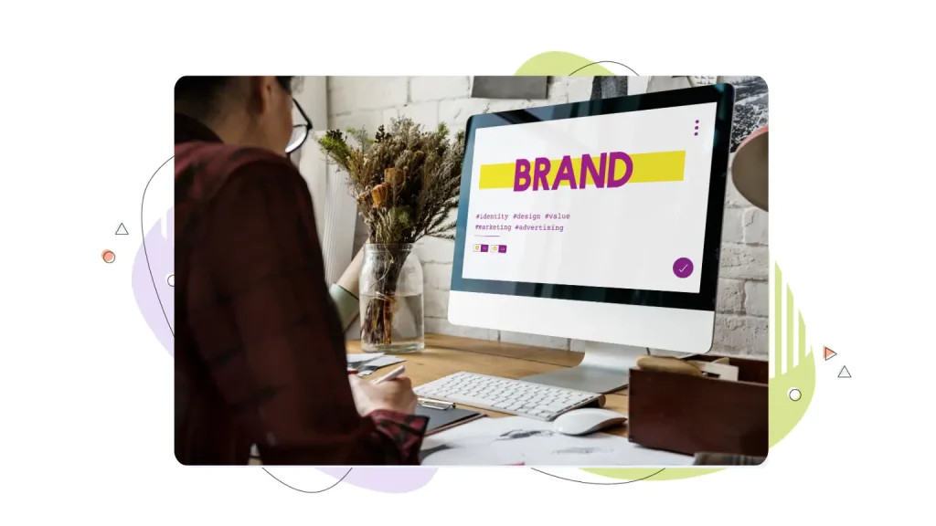
Use Visual Design, Images & Branding Consistently
Visual hierarchy is the art of making the most important things look the most important. On a homepage, this means your headline is bigger than your body text, your CTA button stands out from the background using a contrasting colour, and your brand’s visual language, its colour palette, typography, and imagery style, feels cohesive from top to bottom.
Consistency Is Key
Consistency matters because it builds subconscious trust. When graphic elements look mismatched, visitors sense that something is off, even if they can’t articulate why. Cohesive branding, on the other hand, signals professionalism and attention to detail.
An excellent example of the power of consistency in branding is McDonald’s. There are nearly 45,000 McDonald’s restaurants worldwide, and while the company offers slightly different menu items at each location, the branding is strictly maintained, ensuring strong brand recognition everywhere.
Images Speak Louder Than Words
When it comes to images, relevant images always outperform generic stock photos. A photo of your actual team, your real product, or your customers in context will consistently perform better than a generic shot of a handshake or a laptop on a marble desk. If you’re using illustrations or icons as design elements, keep the style consistent; mixing flat icons with 3D renders, for example, creates visual dissonance.
A few accessibility basics worth baking in from the start:
- All images should have descriptive alt text, not just for screen readers but for SEO.
- Body text should be at least 16px.
- Colour contrast between text and background should meet WCAG AA standards at a minimum.
And remember that bold typography can actually serve as a visual anchor when used deliberately, oversized section headings, for instance, help visitors orient themselves as they scroll through a long homepage.

Write Homepage Copy That Guides Visitors
Homepage copy has one job: to keep visitors moving forward. Every sentence should either inform, reassure, or prompt action. The moment your copy starts to feel like a brochure, you’ve lost the thread.
Optimize Your Content to Keep a Visitor’s Attention
The best homepage copy is structured for scanning. Short paragraphs of two or three sentences maximum. Clear subheadings that communicate the gist of each section, even if nothing else gets read. Bullet points for lists of features or benefits. And action-oriented language that pulls visitors toward the next step rather than passively describing what you do.
One of the most common homepage copy mistakes is leading with features instead of benefits. Features describe what something is. Benefits explain why it matters. “24/7 customer support” is a feature. “Help whenever you need it, even at 2 am” is the benefit, and it’s far more compelling. Think of your homepage as a conversation with a potential customer who’s quietly asking “so what?” after every claim you make. Give the content loads of positive benefits so that it answers that question before they have to ask.
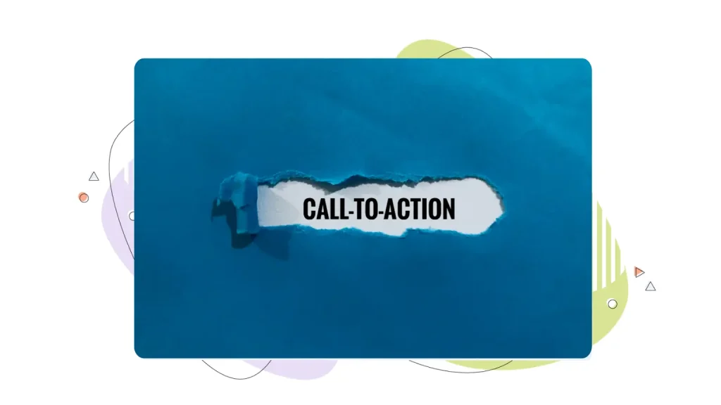
Writing Compelling Calls To Action
CTA copy deserves special attention. “Submit,” “Click Here,” and “Learn More” are the last resort of uninspired copywriting. Strong CTA copy is specific and outcome-focused: “Get My Free Quote,” “Start Saving Today,” “See How It Works.” Even small changes in CTA wording can have measurable effects on conversion rates. Supporting microcopy, short bits of text near a CTA button that address hesitation, like “No credit card required” or “Cancel anytime,” can also meaningfully reduce friction and increase clicks.

Add Social Proof & Trust Signals
There’s a reason you check reviews before trying a new restaurant. Nobody wants to be the first to take a risk. Studies have shown that up to 90% of customers cite some form of social proof as an influential factor when making a purchase. Social proof tells visitors that other people have already tried this thing and found it worth their time and money.
The Different Forms of Social Proof
The most common forms of social proof on homepages include:
- Customer testimonials with names and photos (which are far more credible than anonymous quotes).
- Star ratings from third-party platforms like Google or Trustpilot.
- Customer logos or client logos for B2B businesses.
- Short snippets from case studies or success stories that demonstrate real outcomes.
Any one of these can meaningfully boost visitor confidence; a thoughtful combination of them can speak volumes about the quality of what you offer.
Where to Feature Testimonials
Placement matters as much as the content itself. The most effective strategy is to place social proof close to the actions you want visitors to take. A testimonial near your primary CTA, for example, addresses doubt at the exact moment someone is deciding whether to act. Customer logos near the top of the page validate credibility early in the visit.
Beyond testimonials and reviews, trust badges and security cues play a quieter but important role. An SSL padlock in the browser bar is now table stakes, but displaying security badges, money-back guarantees, and clear contact information (a real phone number or chat option) adds another layer of reassurance, especially for visitors who are new to your brand and evaluating your legitimacy.
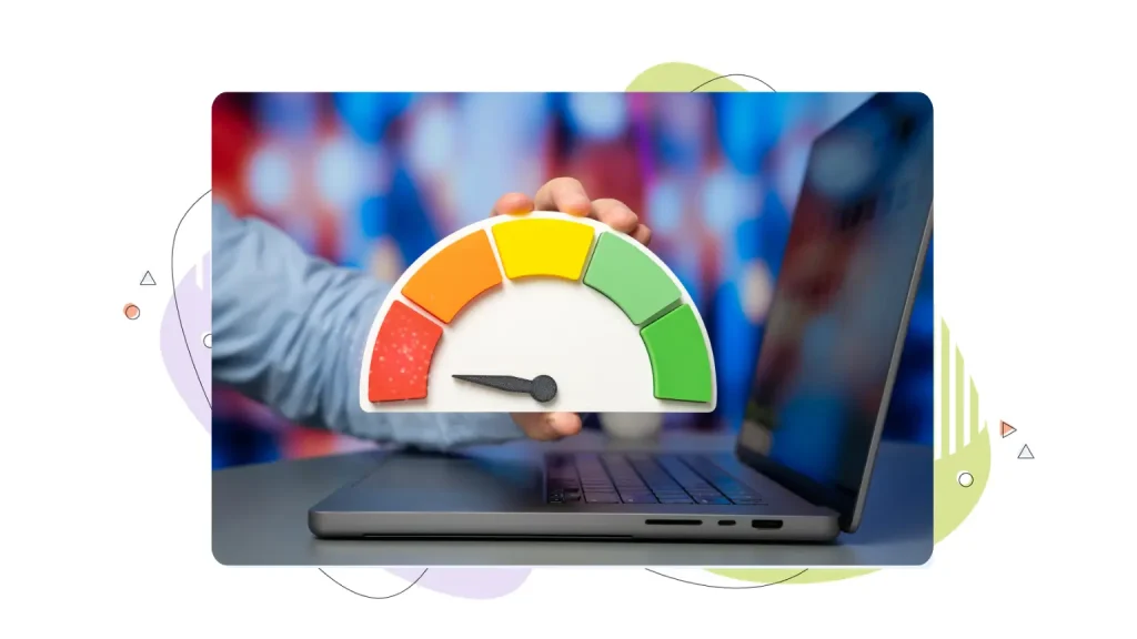
Optimize Homepage Performance, Speed & Mobile Experience
You can have the best-looking homepage on the internet, but if it takes five seconds to load, most visitors will never see it. Google has found that 53% of visitors to mobile sites leave when mobile pages take longer than three seconds to load.
Speed is also a ranking factor for search engines, meaning slow sites appear lower in search results. But more immediately, it’s a user experience issue; every additional second of load time significantly increases bounce rates.
Speed Up Your Most Important Pages
The most impactful optimizations are often the simplest. Here are some things you should do right away.
- Compress your images before uploading them; tools like TinyPNG can reduce file sizes dramatically without visible loss of quality.
- Enable browser caching so repeat visitors load the page faster.
- Minimize heavy scripts and third-party plugins that add JavaScript weight.
- Choose a hosting provider with fast server response times, global data centers, and solid uptime guarantees.
That last point is notable because no amount of front-end optimization compensates for a slow or unreliable server. If you want a responsive homepage that captures attention, go with a reliable Web Hosting provider like HostPapa. HostPapa offers a 99% uptime guarantee, ultra-fast NVMe storage, and performance-tuned servers, ensuring the best possible experience for your users.
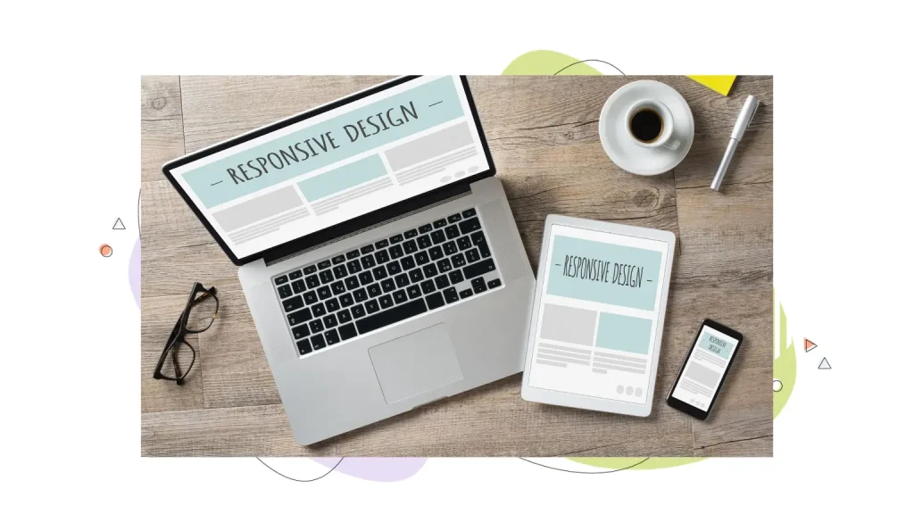
Mobile Performance Optimization
More than half of web traffic now comes from mobile devices, and Google’s search rankings are based on the mobile version of your site first. That means your homepage needs to look great and load quickly on smartphones, not just on desktop.
Use a responsive design so the layout adapts naturally to different screen sizes. Make CTA buttons large enough to tap comfortably (at least 44x44px). And test regularly on actual mobile devices, because what looks fine in a browser’s mobile preview doesn’t always translate to a real phone.

Secure Hosting Is Your Homepage Foundation
Circling back to the importance of hosting, it doesn’t matter how beautiful or persuasive your homepage is if the underlying hosting isn’t reliable. Slow load times, unexpected downtime, and security vulnerabilities don’t just frustrate visitors; they actively undermine trust and hurt your search engine visibility.
What to Look for in a Hosting Provider
Secure website hosting means HTTPS via SSL (which protects data in transit and signals safety to visitors and search engines alike), regular automated backups, server-level security against common threats, and a hosting provider that proactively monitors for issues. For small businesses especially, these aren’t optional extras; they’re the foundation that everything else is built on.
HostPapa is built specifically with small businesses in mind, offering competitive pricing, multiple data center locations for faster global load times, integrated tools for domains, email, and site building, and 24/7 multilingual support for when things get confusing.
Before you invest time and money promoting your homepage, it’s worth doing a quick security check:
- Confirm your SSL certificate is active.
- Verify that backups are running.
- Make sure your site is loading consistently across different regions and devices.
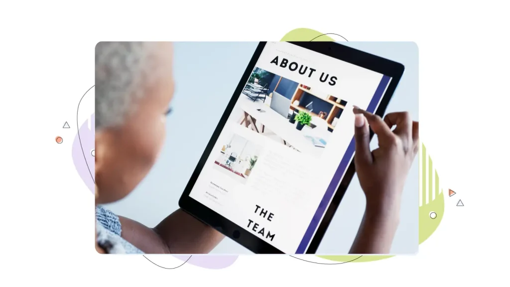
Homepage Design Examples & Ideas for Small Businesses
Sometimes the best way to understand what works is to look at real-world patterns. Here are four homepage archetypes that consistently perform well, along with what makes each one effective, and how you can adapt the ideas for your own site.
The Service Business Homepage
This homepage design typically leads with a bold headline that names the specific service and the location or audience it serves. Think “Expert Landscaping in Albany, New York” rather than “We Love What We Do.”
Beneath the hero, you’ll usually find a simple three-column layout highlighting key services, followed by testimonials from local customers, and a clear “Get a Free Quote” CTA that appears multiple times down the page. The key is specificity; vague service homepages don’t convert.
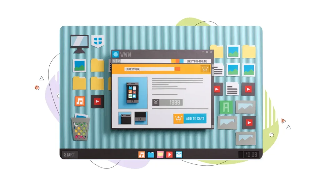
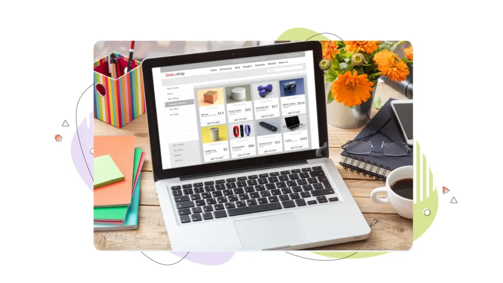
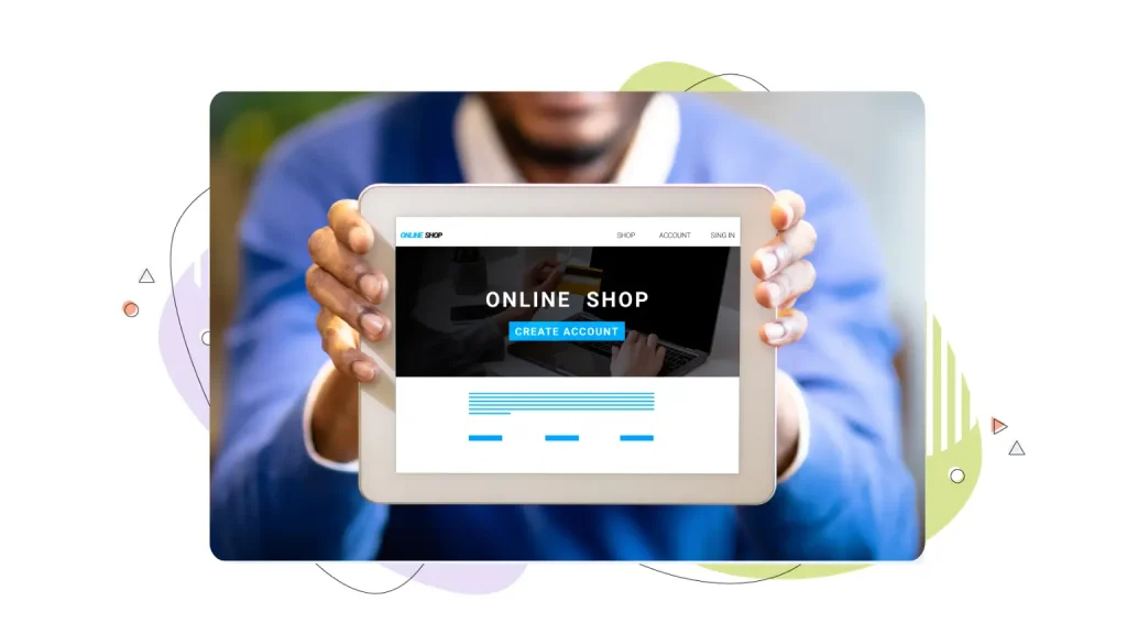
The eCommerce Homepage
A strong eCommerce homepage puts the flagship product or a curated seasonal collection front and centre, often with a large hero image and a single “Shop Now” CTA.
Below the fold, popular services or best-selling categories give visitors an easy entry point into the catalog. Trust signals like free shipping thresholds, return policies, and customer reviews do heavy lifting further down the page.
The Local Business Homepage
Businesses like restaurants, salons, and gyms live and die by clarity and ease of action. Visitors want to know your hours, your location, and how to book, and they want that information fast.
A prominent map embed, a phone number that’s tappable on mobile, and an online booking button above the fold are non-negotiables. Engaging content like photos of the space or team adds warmth.
The SaaS or Online Service Homepage
These homepage designs tend to use a benefit-led headline, a short demo video or a product screenshot in the hero, and a free-trial CTA.
Below the fold, it addresses the key pain points the product solves, uses customer logos to establish credibility, and walks through how the product works in simple steps. The tone is direct, and the copy is light, because the product usually sells itself once people understand it.
Conclusion
Building an effective homepage is a great example of the power of clarity. You don’t need the biggest budget or the most elaborate animations. If you understand your target audience and communicate your offering clearly while building trust, you will have a brilliant homepage design that converts. However, a homepage is not a one-time project you set and forget. You need to constantly evolve your homepage. But the payoff, in leads, sales, and customer confidence, is well worth the effort.
Dependable Web Hosting is a key element of the best homepage designs, ensuring your website is fast and responsive at all times. HostPapa offers fast and secure web hosting solutions, perfect for any size business.
FREQUENTLY ASKED QUESTIONS
How many sections should a homepage have?
There’s no magic number, but most effective homepages have somewhere between five and eight distinct sections: a hero, a benefits or services section, social proof, a content preview or featured offering, possibly an FAQ or about snippet, and a footer.
What should go above the fold on a homepage?
Your headline, subheading, primary CTA, and a supporting visual (hero image or video) should all be visible without scrolling. Other elements can be placed further down the page.
How often should I redesign my homepage?
Major redesigns every two to three years are a reasonable cadence for most small businesses. Between redesigns, ongoing optimization (testing headlines, adjusting CTAs, and refreshing social proof) should happen continuously based on your analytics.
What’s the minimum content a homepage needs?
At minimum: a clear headline, a brief description of what you offer, a call to action, and your contact information. Everything else adds value but isn’t strictly required to have a functional homepage.
What makes a CTA button effective?
Three things: placement, copy, and design. Your main CTA should appear at least twice on the page, once above the fold and once further down for visitors who need more convincing before they act.
What’s the most common homepage design mistake?
Unclear messaging. When visitors interact with a homepage and can’t immediately answer “what does this company do and why should I care?”, the page has failed at its most basic job, regardless of how beautiful it looks. Start with clarity, then add everything else.