If you still treat mobile optimization as an afterthought, you risk alienating more than half of your audience base. This leads to lower conversion rates and a weaker online presence.
In the modern world, you see people hooked to their smartphones everywhere they go, so creating a mobile-first web design is the need of the hour. It’s especially important given that even Google prefers mobile-first indexing.
This article discusses mobile-first web design in detail, covering how to get started and the best practices to follow.
- What Is Mobile-First Web Design?
- Why Prioritize Mobile-First Design?
- Staying Strategic: How to Get Started With Mobile-First Design
- Mobile-Friendly Best Practices
- Your Turn to Create a Mobile-First Web Design!
What Is Mobile-First Web Design?
Mobile-first web design is a strategic approach to creating websites that prioritize the user experience on mobile devices.
In a world where over half of the global web traffic comes from mobile devices, this approach ensures that websites are accessible and optimized for smaller screens.
In 2015, Google announced that mobile-friendliness would be a ranking factor in its search algorithm. This was a game-changer and signaled the shift towards a mobile-centric internet.
Fast forward to 2018, and Google took it a step further with mobile-first indexing, meaning it prioritizes a website’s mobile version for indexing and ranking.
The mantra here is simple: start with the smallest screen and then scale up. It’s like building a house starting from the foundation, ensuring it’s solid enough to support the rest of the structure.
Why Prioritize Mobile-First Design?
Here are some reasons why creating a perfect mobile-first design website is indispensable today:
- Mobile dominance: We’re at a point in internet marketing where mobile devices are not just popular. They’re ubiquitous. In fact, as of 2023, over 54% of global traffic comes from mobile phones. This shows that mobile-first design is no longer an option—it’s an absolute necessity.
- Better conversion rates: Since over half of the global traffic comes from mobile devices, a mobile-first design is bound to increase your conversion rates. Users who get a seamless and intuitive experience on your mobile site will be more inclined to buy from you. For instance, Walmart Canada saw a 20% increase in conversions after optimizing their mobile site.
- Lower bounce rates: If your mobile website takes too long, people are going to leave. Mobile-first design helps keep bounce rates low by ensuring users have a pleasant experience from the moment they land on the site.
- Priority in search engine results pages (SERPs): With mobile-first indexing, Google primarily uses a website’s mobile version for ranking and indexing. So, if your website is mobile-optimized, it’s likely to appear higher in SERPs, increasing visibility and traffic.
- Future-proofing: Statistics show that mobile users are far more than desktop users in terms of internet browsing. The biggest reason is they’re more accessible, and you can use them even on the go, during commutes, to quickly browse despite having a busy workday. With new mobile devices cropping up, creating and optimizing mobile sites help you future-proof your website for the devices of tomorrow.
How To Get Started With Mobile-First Web Design Strategy
Identify Target Audience
When creating a website, the ultimate goal is to appeal to your target audience and get them to take the desired action. It could be signing up for your newsletter, registering for your demo, or making a purchase.
But before you design your site for mobile devices, you need to identify your target audience and understand user intent and preferences.
Where do you begin?
Here are some ways to help you identify your target audience and create a mobile-first website that resonates with them:
- Start by conducting user research. Gather insights into your audience’s demographics, preferences, and online behavior. Leverage social media insights or tools like Google Analytics to identify your audience, which devices they use, and how they engage with your content.
- Next, create user personas. Create user personas based on your findings, including age, gender, occupation, interests, and mobile device usage habits. For example, if you’re targeting young professionals, you might discover that they predominantly use their mobile phones for online activities and prefer sleek, minimalist designs.
- Analyze competitors and industry trends. Look at your competitors’ mobile websites to see how they cater to their audience. This can also give you an idea about the ongoings in your industry and tell you how you can differentiate your design.
- Don’t overlook cultural factors. Mobile usage can vary significantly across different cultures and regions. For instance, in some Asian countries, mobile wallet payments are more prevalent than in the West. Understanding these cultural nuances will be helpful when designing your mobile-first site for a global audience.
Take Spotify’s web design, for example. They first understand their target audience and preferences to tailor their mobile web designs accordingly, even catering to different regions worldwide and implementing website localization.
They provide curated playlists based on user preferences—like Bollywood music for India, Sertanejo for Brazil, and Malay Pop for Malaysia.

Spotify mobile app localization based on their target audience (Source).
Playlists change tunes depending on where you are, so Happy Hits in Taiwan differs from the United States. Plus, they translate everything into their audience’s language whenever possible, making them feel right at home.
Define Your Goals
Once you identify your target audience, it’s time to set your primary goals for mobile-first web design.
What do you want to get out of your site? Understanding this is important so you can design every element to serve a specific purpose.
Here are some common goals you might want to consider when designing your mobile-first site:
- Boost goal user engagement. To do that, focus on a seamless, visually-driven experience to encourage your mobile users to spend more time browsing and interacting with your content.
- Improve conversion rates. Incorporating effective sales strategies into your mobile-first design strategy is crucial for maximizing conversions and revenue. To seamlessly integrate sales into the user experience, focus on personalized content and targeted calls-to-action (CTAs), prioritize clear CTAs, and simplify the checkout process.
- Enhance the user experience. To provide your users with a superior user experience, focus on optimizing your content, load times, and site navigation.
- Boost your search rankings. With mobile-first indexing, improving your site’s SEO can be a key goal. This means focusing on mobile-friendly design elements, fast load times, and structured data.
Prioritize Content And Functionality
In the mobile-first design approach, both content and functionality take center stage.
The goal is to deliver valuable, actionable content without overwhelming the user with extra details that may clutter the screen. To achieve this, you’ll need to strike a balance between providing value and maintaining simplicity.
Want to provide informative content without overwhelming your audience? Here’s how to do that:
- Establish a clear content hierarchy. This entails presenting the most important information first. For example, Airbnb’s mobile app displays key details like property listings, pricing, property specifications, and user reviews first, ensuring a seamless experience for travelers on the go.
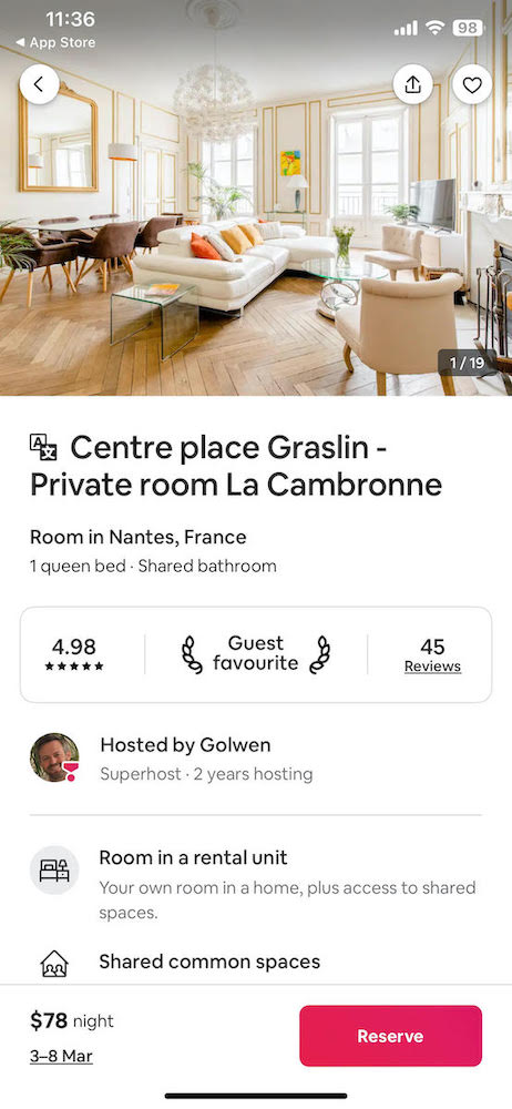
Airbnb content hierarchy example
- Optimize for touch. Design interactive elements with touch in mind. Buttons, links, and form fields should be large enough to tap easily without zooming.
- Speed and performance. Regardless of the device, users expect your site to load quickly, or they might abandon it. Some ways to optimize your mobile site’s speed include compressing images and minimizing the code.
- Localize your content to align with local culture. If you have a global audience, don’t overlook their unique preferences based on their local culture or local SEO. For example, if your mobile site also targets the Japanese market, incorporate their local payment methods, enable translation to the Japanese language, and prioritize features that cater to Japan’s unique mobile usage patterns.
Choose Responsive Web Design
One key aspect of optimizing your site for mobile devices is embracing responsive design.
For the uninitiated, responsive design means creating a website that automatically adapts its content, functionality, and overall layout to the screen size and resolution of the device it’s being viewed on.
This ensures that your website looks and functions well regardless of the device, whether a smartphone, tablet, or desktop.
Here are some quick tips to help you create a responsive mobile design:
- Use fluid grid layouts that adapt to the screen size. This will make your content adapt to different screen widths, providing a consistent experience for all users.
- Add flexible images. This entails ensuring your images can scale up or down to look sharp, no matter the screen size.
- Use CSS media queries. This allows you to tailor your design to specific screen sizes, orientations, and resolutions.
- Keep it simple and minimal. Avoid clutter and focus on the essentials. The more straightforward your design is, the more accessible and user-friendly your site will appear, regardless of the device.
Pro Tip: If you don’t want to worry about the technical details, you can use a website builder like HostPapa that comes with ready-to-use responsive website templates. You simply have to pick the template you like, customize and tweak the web elements, and voilà; you’ll have your responsive website that works best on a desktop or a mobile browser.
Test And Iterate
Your job isn’t over after creating a mobile-first web design and making it live for your audience.
Now, you have to consistently test it to ensure it’s working as intended and make changes based on your testing results. Pick the best fonts and make changes to the user interface so that it aligns with your brand image.
Start with tools like Google’s Mobile-Friendly Test or BrowserStack to check your site’s performance on different devices. Regular testing helps you catch and fix any issues that affect the user experience.
To keep on improving your site, implement A/B testing to compare different versions of your design and see which one performs better. For example, you might test two different call-to-action (CTA) buttons to see which one your audience better receives.
Remember, testing isn’t a one-off process. Iterate your design based on the results you uncover from your tests. This might mean simplifying navigation, tweaking layouts, or refining content to better meet user needs.
It’s an ongoing process, so make changes, test again, and continue refining your design.
Mobile-Friendly Best Practices
Creating a mobile-friendly website is a lot like building a Swiss Army Knife. You have to take care of multiple aspects; it has to be compact, efficient, and versatile simultaneously.
Here are some best practices to help you create mobile-friendly web pages:
- Simple navigation: Mobile screens are limited in size, so elaborate navigation options are not an option. To streamline navigation, take a minimalist approach with easy-to-use menus and intuitive touch controls. You can also use the hamburger menu for a clean look.
Hamburger menu example (Source)
- Larger font: Visitors shouldn’t have to squint to be able to decipher content on your site. Use large font sizes to avoid that, and make your content easily readable on smaller screens.
- High-quality image: Low-quality images on a website are a massive turn-off and don’t bode well for your brand’s reputation. If you want to generate high-quality leads or increase conversion rates, high-resolution images optimized for mobile devices are non-negotiable. At the same time, they should look sharp and load quickly.
- Minimal clutter: Mobile screens are already compact. To maximize your space and avoid confusing your audience, keep your mobile-first site crisp and clutter-free.
- Touch-friendly interactions: Design with fingers in mind. Buttons and links should be large enough, allowing you to easily tap and make swipe gestures for navigation.
- Offline functionality: Users may find themselves in areas with spotty coverage from time to time. To alleviate this issue, offer an offline functionality on your mobile site or app, allowing users to access your content on the go despite not having internet access.
Your Turn To Create A Mobile-First Web Design!
With both users and Google giving preference to mobile sites, creating a mobile-first web design is paramount. It will help you reach a wider audience, gain conversions, and higher search engine rankings.
To simplify the process of creating a mobile-first web design, you can also use a website builder like HostPapa with hundreds of mobile-friendly templates. This way, you can create a visually appealing, mobile-first website without technical know-how.
Looking for a site? Join HostPapa’s thousands of satisfied customers! Because a happy web host leads to a happy website!
Author: Cass Rosas – Omniscient Digital


