Without a CTA, even the most persuasive content leaves visitors wondering what to do. They’ve read your pitch, they’re interested, and then… nothing. No button. No direction. That’s a missed opportunity and missed revenue.
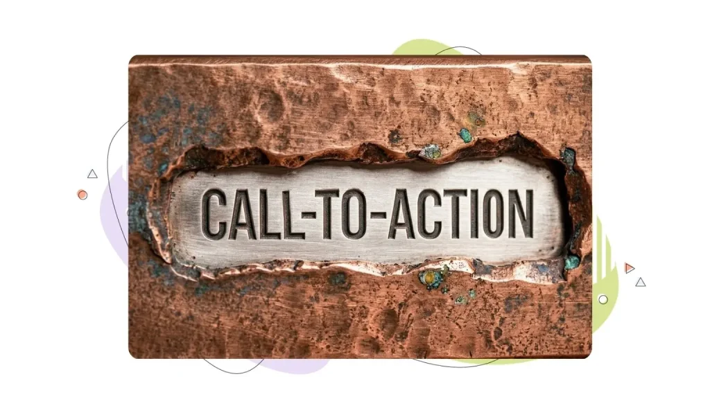
Call to action definition: In call to action marketing, a CTA is a short prompt on a web page, email, or ad that tells visitors exactly what to do next. Think of it as a signpost that says, “Here’s your next step.” It can be a button that reads “Sign Up Free,” a text link that says “Download the Guide,” or a banner that invites visitors to “Get a Quote.”
CTAs show up everywhere: on landing pages, in product descriptions, across email campaigns, inside blog posts, and on social media ads. Any time you want someone to take a specific action, a CTA makes that action clear and easy to follow.
What a CTA is not: A generic navigation link like “Home” or “About” isn’t a CTA. Neither is a vague “Click here” with no value attached. A true CTA connects a specific action to a specific benefit for the visitor.
- Why Calls to Action Matter & What Happens Without Them
- CTA vs. Value Proposition vs. Button Text: What’s the Difference?
- Types of CTAs: Soft vs. Hard & When to Use Each
- Where to Place CTAs on a Website (Homepage, Product, Blog, Landing Pages)
- Anatomy of a High-Converting CTA (Copy, Design & Context)
- How to Write CTA Copy That People Actually Click
- CTA Button Best Practices
- Common CTA Mistakes (& Quick Fixes)
- CTA Examples & Templates by Goal
- How to Test & Improve Your CTAs (Without Guessing Where to Focus)
- The CTA Checklist for Small Business Websites
Why Calls to Action Matter & What Happens Without Them

Every page on your website should answer one question for the visitor: “What do I do next?” A CTA provides that answer.
Here’s why CTAs are a big deal for small businesses:
- They guide the user journey. Visitors don’t always know the next step. A CTA removes guesswork and moves people from browsing to buying, signing up, or reaching out.
- They drive measurable results. Leads, sales, signups, demo requests, and newsletter subscriptions all start with a click on a well-placed CTA.
- They affect your bottom line. Emails with a single CTA can boost clicks by 371%. Personalized CTAs improve conversion rates by 202% compared to generic ones.
The “cost of no CTA” is real. Without a clear prompt, visitors drop off the page. Intent fades. And the effort you put into creating great content goes to waste because there’s no path from interest to action.
CTA vs. Value Proposition vs. Button Text: What’s the Difference?
These three elements often get confused, but they each play a different role on your page:
| Role | Example | |
| Value proposition | Explains why someone should care. | “Build your website in minutes with AI.” |
| Offer | Describes what the visitor gets. | “Free 30-day trial with no credit card.” |
| CTA | Tells the visitor what to do now. | “Start Your Free Trial” |
Think of it as a sequence: the headline hooks attention with a benefit, the offer spells out what’s included, and the CTA makes the next step obvious.
A common mistake is spending hours polishing button text while the offer behind it is unclear. If visitors don’t understand what they’re getting, no amount of clever wording on the button will save the click.
Types of CTAs: Soft vs. Hard & When to Use Each

Not all types of calls to action ask for the same level of commitment. The key is matching the CTA’s strength to where the visitor is in their journey.
Soft CTAs (Low Commitment)
Soft CTAs work best during the awareness and consideration stages. The visitor is still learning, comparing, or researching. Soft CTAs include:
- “Learn More”.
- “Download the Free Guide”.
- “Read the Case Study”.
- “Watch the Demo”.
- “Subscribe for Updates”.
Hard CTAs (High Commitment)
Hard CTAs suit the decision stage, when visitors are ready to act. They include:
- “Buy Now”.
- “Book a Demo”.
- “Start Your Free Trial”.
- “Get a Quote”.
- “Sign Up Today”.
Quick rule of thumb: If someone just found your website through a blog post, a soft CTA (“Download the Checklist”) makes sense. If they’re on your pricing page, a hard CTA (“Choose Your Plan”) is the right fit.
Where to Place CTAs on a Website (Homepage, Product, Blog, Landing Pages)
Placement can make or break a CTA’s performance. CTAs placed above the fold can improve conversion rates by 10-15%, while end-of-content CTAs see a 20-30% increase in conversions.
Here’s a quick guide by page type:
- Homepage: Feature your primary CTA (for example, “Get Started” or “See Plans”) above the fold and repeat it after key sections. Use a secondary CTA (for example, “Learn More”) for visitors who aren’t ready to commit.
- Product or pricing page: Lead with a hard CTA (“Choose Your Plan” or “Start Your Free Trial”). This is where visitors compare options and make decisions.
- Blog post: Include an inline CTA related to the topic, a CTA at the end of the post, and a contextual sticky or sidebar CTA. Inline CTAs within blog content have a 121% higher click-through rate than sidebar CTAs.
- Landing page: Stick to one focused CTA. Repeating it at the top and bottom of the page is fine, but all CTAs should point to the same goal. Pages limited to one clear CTA boost conversions by 266%.
Primary vs. Secondary CTAs
Every page should have one primary CTA, which is the main action you want visitors to take. A secondary CTA is a softer fallback for people who aren’t ready for the primary action. Make the primary CTA stand out through size, color, and position. Keep secondary CTAs visually understated so they don’t compete.

Anatomy of a High-Converting CTA (Copy, Design & Context)
A CTA that converts well has three parts: action verb, outcome or benefit, and friction reducer.
Here’s how that looks in practice, through a simple formula:
| Part | Purpose | Example |
| Action verb | Tells the visitor what to do. | “Start,” “Get,” “Download,” “Claim.” |
| Benefit or outcome | Shows what they’ll gain. | “Your Free Trial,” “More Sales,” “Your Guide.” |
| Friction reducer | Removes hesitation. | “No credit card required,” “Cancel any time.” |
Before & After CTA Rewrites
| Generic CTA | Benefit-Driven CTA |
| Submit | Get Your Free Quote. |
| Click Here | Download the 2026 Marketing Checklist. |
| Learn More | See How We Can Help Your Business Grow. |
Context match matters. A CTA should deliver on what the page promises. If your blog post is about email marketing tips, the CTA shouldn’t jump to a hosting plan. It should offer a related resource, like a free email template or a link to your email marketing guide.
How to Write CTA Copy That People Actually Click
Writing CTA copy was never only about being clever. It’s about being clear. Here’s a simple formula:
Verb + Benefit + Confidence Cue
- “Start Your Free Trial: No Credit Card Needed”.
- “Download Your Checklist: Takes 10 Seconds”.
- “Get Your Custom Quote: 100% Free”.
Tips for stronger CTA copy
- Be specific about what happens after the click. “Get Your Free SEO Audit” tells visitors exactly what they’ll receive. “Submit” does not.
- Use action verbs. Start with words like “Get,” “Start,” “Download,” “Claim,” “Join,” or “Try.”
- Test first-person vs. second-person. Changing “Start your free trial” to “Start my free trial” has shown a 90% increase in clicks in some tests. First-person phrasing puts visitors in the driver’s seat.
- Keep it short. If it takes more than six seconds to read your CTA, it’s too long.
CTA Button Best Practices
Design plays a big role in whether visitors notice and click your CTA. Here are the key areas to focus on:
Contrast & Whitespace
Your CTA button needs to stand out from everything else on the page. Use a contrasting color that’s different from your background and surrounding elements. Surround the button with whitespace so it’s easy to spot. Red CTAs, for example, have been shown to boost conversion rates by 21%.
Mobile-First Design
More than half of web traffic comes from mobile devices, so your CTA needs to work for thumbs, not just mouse clicks. Buttons should be at least 44×44 pixels (the WCAG minimum), though 48-56 pixels is safer for people with motor challenges. Use sticky CTAs only when they add value, and avoid stacking multiple buttons that could lead to accidental taps.
Accessibility Basics
Accessible CTAs aren’t just good practice. They help you reach more visitors.
- Color contrast: Maintain a minimum contrast ratio of 4.5:1 between text and background.
- Descriptive text: Avoid vague labels like “Click here.” Screen readers need clear, specific text that describes the action. “Download the Free Guide” works for everyone.
- Keyboard navigation: Make sure CTA buttons can be reached and activated using the keyboard alone, not just by mouse or touch.
Common CTA Mistakes (& Quick Fixes)
Even small CTA mistakes can hurt conversions. Here are the most common ones and how to fix them:
- Too many competing CTAs. When a page has multiple CTAs pointing to different goals, visitors get stuck choosing and often leave without clicking anything. Fix: Choose one primary action per page. Pages with a single CTA boost conversions by 266%.
- Vague copy. Buttons labeled “Submit” or “Click here” don’t tell visitors what they’re getting. Fix: Replace with outcome-focused language. “Submit” becomes “Get Your Free Quote.”
- Asking too much too soon. Dropping a “Buy Now” CTA on someone who just found your blog post is like asking for a commitment on a first meeting. Fix: Match the CTA’s strength to the visitor’s intent stage. Use soft CTAs for top-of-funnel content and hard CTAs for bottom-of-funnel pages.
- Poor visibility. If the button blends into the background, visitors won’t notice it. Fix: Use contrasting colors, larger button sizes (bigger buttons increase clicks by 90%), and plenty of whitespace.
- Ignoring mobile. A CTA that looks great on desktop can be too small or poorly spaced on a phone. Fix: Design mobile-first with thumb-friendly spacing and test across devices.
CTA Examples & Templates by Goal
These call-to-action examples are ready to use. Just swap the bracketed text for your specific offer.
Lead Generation
- “Download Your Free [Resource Name]”.
- “Get the [Year] [Topic] Checklist”.
- “Claim Your Free [Benefit]”.
Sales & eCommerce
- “Shop [Product Category] Now”.
- “Add to Cart: Free Shipping on Orders Over [Amount]”.
- “Get [Percentage]% Off Your First Order.”
For more ways to improve your online store’s conversions, check out our guide on eCommerce conversion strategies.
Newsletter & Email Signups
- “Join [Number] + [Audience Type] Getting Weekly Tips.”
- “Subscribe for Free [Topic] Updates.”
- “Sign Up, It’s 100% Free.“
Looking to improve your email game? We’ve put together a list of the best email marketing tools for small businesses.
Demo or Quote Requests
- “Book Your Free [Demo/Consultation]”
- “Get a Custom Quote in [Timeframe]”
- “Talk to a [Role] Today”
Webinar or Download
- “Reserve Your Spot: [Number] Seats Left”
- “Watch the Free [Topic] Webinar”
- “Download the [Resource]: No Signup Required”
How to Test & Improve Your CTAs (Without Guessing Where to Focus)
Guessing doesn’t scale. A/B testing your CTAs does, and it doesn’t have to be complicated. Here’s how to approach CTA testing the right way:
What to Test
Test one variable at a time to keep results clear:
- Copy: Try different verbs, pronouns, or benefit statements. For example, “Start My Free Trial” vs. “Try It Free for 14 Days.”
- Design: Swap button colors, sizes, or shapes. Even small changes can produce measurable differences.
- Placement: Move the CTA above the fold, inline, or to the end of the page and measure the impact.
- Offer framing: Test what you’re promising. “Save 2 Hours a Week” vs. “Try Our Reporting Tool” can deliver very different results.
What to Measure
Clicks aren’t the full picture. Track these metrics together:
- Click-through rate (CTR): How many people clicked the CTA.
- Downstream conversions: How many of those clicks turned into actual signups, purchases, or leads.
- Revenue per visitor: The business value generated from CTA clicks.
A Practical Testing Cadence for Small Businesses
- Run each test for at least 7-14 days to reach a meaningful sample size.
- Test high-impact elements first: CTA copy and button color tend to move the needle most.
- Document every test result so you build a library of what works for your audience.
- Make testing a regular habit. 71% of companies run two or more A/B tests per month.
The CTA Checklist for Small Business Websites
Use this checklist to make sure your CTAs are set up for success:
- One primary CTA per page. Every page has a single, clear main action.
- Benefit-driven copy. The CTA text tells visitors what they’ll get, not just what to do.
- Friction reducers included. Add confidence cues like “No credit card required,” “Cancel any time,” or “30-day money-back guarantee.”
- Contrasting button color. The CTA stands out from the page background and surrounding elements.
- Mobile-friendly sizing. Buttons are at least 44×44 pixels with thumb-friendly spacing.
- Accessible labels. CTA text is descriptive and works with screen readers. No vague “Click here” labels.
- Above-the-fold placement. The primary CTA is visible without scrolling.
- Your page loads quickly. Every 1-second delay in mobile loading can drop conversions by up to 20%.
- Trust cues nearby. Add social proof, testimonials, or security badges close to the CTA to build confidence.
- Fast, reliable hosting. A slow or offline site kills conversions before visitors ever reach your CTA. HostPapa’s 99.9% uptime guarantee and NVMe-powered servers keep your pages loading quickly.
- Consistent across devices. Test the CTA on desktop, tablet, and mobile before publishing.
- A/B test regularly. Test one element at a time and document results.
- Aligned with the page goal. The CTA matches the content’s promise and the visitor’s intent stage.
One more tip: if you have more than one offer, give each offer its own dedicated landing page. A focused page with a single goal and a single CTA consistently outperforms pages that try to do everything at once.
A great CTA deserves a great website behind it. If you’re ready to build a site that converts, HostPapa’s Website Builder gives you everything you need: drag-and-drop design, AI-powered setup, built-in SEO tools, and free SSL to keep your visitors’ data safe.
Our PapaSquad support team is available 24/7 by phone, chat, and email if you need a hand getting started.
Join 500,000+ website owners and use our AI-Powered Website Builder today or choose our Web Hosting solutions to bring your idea to life!