Your Contact Us page is one of the most important pages on your website. It’s the first page customers visit to look for help, and it plays an all-important role in converting customers on the verge of making a decision.
It’s a tool for satisfying loyal customers and can be a vital part of the buyer journey, too. In fact, nearly 83% of customers feel more loyalty to brands that respond to and resolve their complaints. Moreover, 50% of marketers say that online forms are their highest converting lead gen tool.
This proves how important a well-designed contact page really is. In this blog, we’re diving into everything you need to know about Contact Us pages—expert tips, standout examples, templates, Contact Us forms, and more. Keep reading to learn how to create a page that truly connects!
- Why a Contact Us Page Is Crucial for Your Website
- What Makes the Perfect Design for Your Website?
- Key Tips for Crafting the Ultimate Contact Page
- 25 Stunning Contact Us Page Examples: What Works & Why
- Best Contact Form & Contact Us Page Templates
- Create a Flawless Contact Us Form: Best Practices
- Contact Page Mistakes: Avoid Making These Errors
- How to Test & Improve Your Contact Page
- Your Guide to a Contact Page That Works
Why a Contact Us Page Is Crucial for Your Website
A Contact Us page is mandatory because it’s a direct communication link between your business and its customers. It’s often one of the most visited pages on a website, making it a huge touchpoint for engagement and support. It’s also a tool for converting customers.
Regardless of what domain you’re in, building trust with your audience is a high priority. A well-built, responsive page does exactly that. It can also give quick support and can convert people into loyal customers by showing that you value open communication.
The right page design should help your business by polishing:
- Lead generation: An easy-to-use form captures potential customer inquiries, turning visits into leads.
- Customer service: Providing good customer service is a deciding factor, and it’s a reliable way for users to reach out, which builds trust and credibility. The customer service team might feel like just another cog in the business wheel, but it makes visitors feel valued and supported.
- SEO boost: Some search engines view contact pages as credibility markers, boosting your rankings.
- Spam defence: Forms filter spam, protecting your inbox.
- Data sync: Use form data with marketing tools and CRM systems.
- Easier navigation: Clear and accessible details like phone, email, and business hours upgrade the user experience.
- Mobile-friendliness: Responsive design gives an excellent user experience on all devices.
What Makes the Perfect Design for Your Website?
The perfect design can vary widely for every website. However, some research suggests that simplicity drives conversions. When it comes to contact pages, clean, simple layouts tend to convert better by reducing friction.
Overloading the page with too much information can lead to higher bounce rates, especially for users looking to resolve issues quickly. This rule can apply to virtually every website, no matter your industry.
When it comes to your specific niche though, that’s where it gets a bit complicated. Different audiences prefer different features across industries. For example, if your target audience is B2B based, that audience may prefer scheduled calls or direct emails.
On the other hand, if your audience is B2C based, your users might value quicker help through live chat or access to FAQs. Things vary widely; that’s why it’s good to consider who will be viewing your Contact Us page when creating one.
Another example is younger versus older audiences. If your audience is mostly Millennials and Gen Z users, messaging, not calls, will likely be preferred. So, in this case, social media support or SMS options might be better.
For older audiences, a more traditional approach, like phone support or email forms, could be better. Again, for the very best results, tailor your design to your audience.
If you don’t have the skills to design a quality contact page, it might be better to find someone who can. If DIY templates aren’t your thing, look for either an individual designer or a quality web design agency so your page is properly built.
In need of a website? HostPapa’s long list of prominent Web Hosting features awaits!
Key Tips for Crafting the Ultimate Contact Page
It’s not as simple as having a page with your contact info—it’s a little deeper than that. However, creating a solid Contact Us page might not be as complex as you think. Here are some tips on the fundamentals:
1. Perfect Call-To-Actions
One integral part of any page design is its call-to-actions. Your contact page should have clear, readable, compelling CTA buttons. Guide your visitors to take action, whether it’s filling out a form, using live chat, or scheduling a call.
It’s also best if you use a bit of clever wordplay to grab attention. For example, a bright CTA button saying “Limited Spots, Book Now!” would likely convert better than a button simply saying “Book.”
2. Create Quality Contact Forms
A high-quality contact form should be simple, clear, and easy to fill out. Focus strictly on getting important info like the contact’s name, email, and message. Too many fields can confuse and overwhelm visitors, so try keeping it simple.
Place field labels directly above each input to make them easy to follow, and use contrasting colours on the submit button to make it pop. For example, black text on a white background or black text on a yellow background, etc. Avoid using colours that don’t contrast well.
Bonus tip—try adding a personalized message on the form to create a friendly touch, like “We’d love to hear from you!” It’s also smart to test for clarity and usability so the user experience is as smooth as possible.
3. Have Multiple Contact Options
Not every customer wants to reach out in the same way. Offering multiple contact methods—like email, phone, and live chat—gives users flexibility based on what they prefer. A “Schedule a Call” step is great for customers wanting a one-on-one connection, while a live chat supports users with quick questions.
Consider adding social media links as well, so visitors have another way to engage. By catering to people’s different preferences, you create a user-friendly experience.
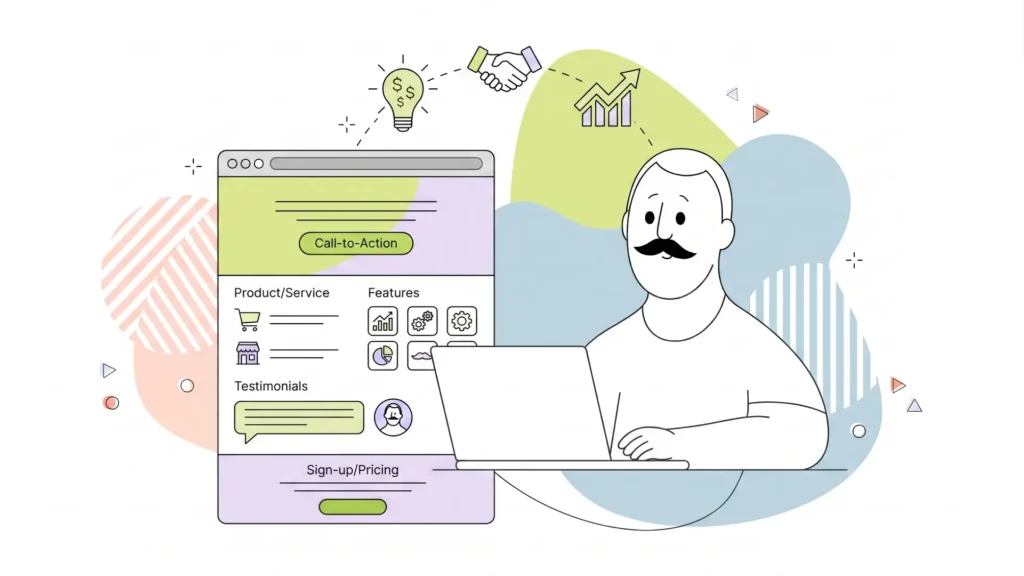
4. Use Interesting Visuals
A contact page shouldn’t be boring. Adding visuals can make it more engaging to your customers. Consider using friendly images, icons, and perhaps even create a professional-looking video to welcome customers and drive your message home.
Add some decorative visuals, like an arrow pointing to the contact form, to guide the user’s eye and add personality. For added appeal, try including a team photo or a customer success image to build trust and show the real people behind your brand. A trendy, appealing page is much more likely to encourage interaction from your customers.
5. Include Company Details
Clear company details build your credibility in the eyes of customers. They also make it easier for users to trust your business. Adding things like your office address, phone number, and email helps a lot. When visitors see this, they know they’re dealing with a legit company.
For press-related questions and collaborations, include a section for press inquiries. This ensures that media communication and outreach are handled efficiently.
Including your business hours also sets realistic response time expectations. This is especially helpful for international visitors. Adding a response time can prevent frustrated customers since they know exactly when they’ll speak to you.
Also, if you have multiple locations, consider adding a map or location-specific contact information. These details can reassure users and add a professional touch to your contact page.
Practically all of these tips relate to perfecting the user experience. Your design should be functional, easy to navigate, responsive, and look stunning.
6. Sharpen for Mobile
With more people browsing on smartphones than ever before, it’s imperative that your contact page looks sharp on all devices. Use mobile-friendly forms, a responsive layout that adjusts for different screen sizes, and large touch-friendly buttons. No one likes trying to click a tiny button and accidentally clicking something else.
Don’t forget to keep the design simple, as mobile users don’t want to scroll endlessly or zoom in on text. Having a fast-loading, mobile-ready contact page can reduce bounce rates and make it easier for people to reach out while on the go.
25 Stunning Contact Us Page Examples: What Works & Why
1. HostPapa
Their contact page: See our page
Why it works: HostPapa is a web hosting company that offers many services for personal and professional websites. Our contact page is designed with a multi-functional strategy. The layout is convenient for users, with clear preferences to connect by phone, fax, mail, or email. The wide variety of support alternatives makes a great customer experience.
What makes our page unique is the “one-on-one video training session.” With this feature, users can book a call directly with a HostPapa training expert.
Little to no scrolling keeps the user experience simple. The green CTA button links to a helpful video, teaching users more about our award-winning customer care. HostPapa also provides 24/7 support, so visitors from any part of the world have access at any time.
The availability of international numbers really extends our reach, making our page great for all audiences. Ready to build the perfect Contact Us page? Try HostPapa’s drag-and-drop Website Builder used by web design experts all over the world.
2. Embark
Their contact page: See Embark’s page
Why it works: Embark is an award-winning digital marketing agency. One standout feature of their contact page is how they use human faces to build trust.
Studies indicate that seeing images of people, instead of logos or text, can build a sense of familiarity. Also, if a customer needs help, seeing faces promotes feelings that they’ll be helped by real humans—not automation.
Embark uses its elegant olive green branding on its contact form, which takes up the entire right side. Their body text is nice and large, promoting great readability. Unlike many companies that hide their contact info, Embark clearly displays 5 different contact methods for customers.
Their phone number, email, contact form submission, and Zoom call availability are shown in plain sight—not four clicks away from the contact page. The page has a responsive feel and loads quickly, making Embark one of the better contact page examples.
3. Thrive Agency
Their contact page: See Thrive’s page
Why it works: Thrive uses a bold, white contact form on the left side of the page. Their page is primarily aimed at potential leads, not just customers. However, there are multiple phone numbers available in the header and body text for customers who need them.
One thing that boosts their credibility is what’s just below the fold. If you scroll down, you’ll see numerous examples of social proof. There are customer reviews, success stories, awards, and, most importantly, the client’s results achieved for their clients.
This builds trust with potential customers who might be on the fence about partnering with Thrive. Thrive is a great example of a contact page that’s conversion-focused.
4. Nextiva
Their contact page: See Nextiva’s page
Why it works: Nextiva is a customer conversation suite helping companies communicate with customers. It’s safe to say they’re knowledgeable about building a helpful Contact Us page.
They have large, interactive buttons where visitors can access their “Video Hub” and other educational areas. They have an integrated AI chat that seems very human-like and answered our questions quickly. Obviously, AI isn’t as good as human support. But a quality AI chatbot can make a huge difference with customer experience.
Nextiva focuses on autonomy with a search bar at the top of the page. If you don’t mind putting some effort into solving your own issues, this feature is pretty helpful. It seems to be more responsive than other similar search bars. We were quickly able to access countless articles for any issue we presented it with.
One general rule about customer support is—if you’re going to focus on do-it-yourself strategies over human help—you better make sure they’re quality strategies. It would be a mistake to give customers some poorly designed AI chat, or a search bar with a lack of helpful search results.
Nextiva doesn’t do that. They emphasize quality autonomy with the possibility of human help if you search hard enough. This benefits both customers and Nextiva by reducing the need for hiring customer service employees, while still providing great customer service.
5. Codica
Their Contact Us page: See Codica’s page
Why it works: Codica is a software development company. They immediately stand out from other contact pages because of their human-like AI chat. Their header has a CTA button reading “Get a free quote,” which helps convert users. Another unique feature is a photo of the real-life employee who will be helping customers.
The button reads “Our Sales Manager Taya will be in touch with you within 1 business day.” Needless to say, this gives customers a comforting feeling, indicating that human help is on the way. If you scroll down, you’ll see more contact methods, including their email and phone number.
Scroll further down, and you’ll find more trust-building features. Codica lists several awards they’ve been given, which proves their legitimacy to customers. Overall, Codica is a great example of a Contact Us page that is AI-driven with a human touch. You can thank their skilled development team for that.
6. Google
Their contact page: See Google’s page
Why it works: Much like Apple’s contact page, Google goes all in on self-guided strategies. They offer a search bar, coupled with buttons for their other platforms like Gmail, YouTube, Chrome, and more. A single click takes users to a tailored self-enabling centre, where there are answers to problems related to specific sections.
It’s Google, so flawless user experience and fast page loading is expected. They definitely deliver on that. Page load speed is excellent. Also, clicking the search bar guides users to a page where they can “post to the help community.”
This allows them to get human answers from others in the Google community. There is no immediate customer service phone number available—at least until you click through to a few deeper pages. Overall, they have a well-designed Contact Us page that conveniently prioritizes self-reliant strategies in a convenient way.
7. WebFX
Their contact page: See WebFX’s page
Why it works: WebFX is a digital marketing company. They clearly show their design skills with a functional contact page design. Also, they make it convenient for customers by listing their phone numbers right in your face.
Take one glance above the fold, and you’ll see 5 different contact numbers, plus a sixth one in the header section. This will satisfy many customers who prefer immediate help through phone calls.
They have a great example of a contact form that is simple. Their plain, white layout on the right side of the page keeps things basic. Although the text is a bit small, it’s still easy for customers to read as there’s plenty of whitespace. If you scroll down below the fold, you’ll see the physical address of each of their locations.
For companies that have plenty of customer service availability via phone, WebFX makes a great Contact Us page idea.
8. HubSpot
Their contact page: See HubSpot’s page
Why it works: HubSpot shows how a contact page can be a powerful customer service tool. With two clear CTAs for Sales and Support right above the fold, HubSpot anticipates visitors’ needs—whether that’s to buy something or seek help.
One standout feature is that the Contact Us page is fully integrated into the HubSpot portal, making it easy to access. Users don’t have to navigate away to find a support number, creating a convenient omnichannel experience that keeps customer service well-planned and convenient.
A live chatbot button, located at the bottom right, also allows visitors to handle basic questions on their own, saving time for the customer and the HubSpot team. HubSpot overall has a well-designed contact page.
9. Zapier
Their contact page: See Zapier’s page
Why it works: Zapier uses its bright orange brand colours throughout its contact page. This gives a bright, energetic feel to their contact page design. They boast of 24-hour availability and human-powered support, which is something new customers want to hear.
You can click their support buttons reading “On-demand resources,” “Connect with a human,” and “Custom solutions.” They give you the ability to speak to a live person within 8 hours if “Connect with a human” is clicked.
More copy that builds trust is displayed, reading statements like “Our team is your team.” Also, they have real-life quotes from satisfied customers, one reading “Zapier’s support staff is top notch… everyone I spoke with is well-versed in automation and will always make suggestions if what I’m trying doesn’t work.”
Showing quotes like this works wonders for building your reputation with customers. Zapier has a solid, energetic page design, focused on building trust.
10. Pixpa
Their contact page: See Pixpa’s page
Why it works: Pixpa’s contact page has a clean, blue and white gradient and has a functional design. The site features different sections: Above the fold, it has a clear, white CTA button and a contact form users can fill out.
Below the fold are more resources such as “Help Centre,” “Live Support,” and “Hire a Pixpa Expert.” Their layout minimizes distractions and isn’t overly promotional of their services. This is great for users wanting to focus on getting support. They also have 24/7 live chat and email assistance so users can get immediate help.
One unique feature is the “Hire a Pixpa Expert” service, providing custom web design support. This is ideal for users seeking a more hands-on, professional touch. This combination of attractive colours, bold (but not overly bold) CTAs, and support routes makes Pixpa a great example of a quality contact page.
11. Asana
Their contact page: See Asana’s page
Why it works: Asana’s contact page is designed with a simple user experience in mind. It features a clean, simplistic layout that doesn’t overwhelm users. The page uses large, readable fonts, making the user interaction better.
One helpful feature is their AI chatbot integrated into the page, offering support for users who need help quickly. The AI doesn’t seem as robotic as some other chatbots. Their page is nearly scroll-less, designed for responsiveness, and loads fast. These features, combined with a simple contact form, make Asana’s page simple and user-friendly.
12. Zendesk
Their contact page: See Zendesk’s page
Why it works: Zendesk’s contact page embraces simplicity. They focus on clear navigation and accessibility. Large, bold, in-your-face CTA buttons for support are easily clickable.
An AI chatbot offers instant, automated support, helping people get quick answers without waiting for a live agent. Their design is mobile-friendly, too, and works great on iPhone or other smartphones with smaller screens.
Their beige and purple colour palette is calming but still feels professional. Zendesk is a great example of a contact page that promotes professionalism with a touch of trendy colours.
13. Netflix
Their contact page: See Netflix’s page
Why it works: Netflix’s contact page keeps things simple and helpful. The search bar at the top allows users to find articles that solve their issues, similar to Medium’s approach. Once you search your issue, the following page offers the ability to text chat with a human or call customer services directly.
Many companies tend to hide their customer support phone number to avoid overwhelming their team with callers. This is likely why Netflix has their human support one click away, instead of on the initial contact page.
Their layout is minimal, and navigation feels smooth. It’s easy to access support on any device, including smartphones. This combination of features gives a great customer experience while still using some self-sufficient strategies. If that’s the experience you want to project, Netflix’s Contact Us page is a great example.
14. Ahrefs
Their contact page: See Ahrefs page
Why it works: Ahrefs is an SEO-focused software tool and educational platform. Their “help centre” has an incredible design focused on self-enablement. Although it’s not necessarily a Contact Us page, it could pass as one. Their quality do-it-yourself experience answers almost any question imaginable, and the design is easy to navigate.
They use a white and blue gradient as their background colours, which makes the page pop. Also, with visible categories for different support topics, users can access specialized help. Things like FAQs, a search bar, and links to hundreds of articles all revamp UX.
Ahrefs doesn’t have an immediate customer service number that we can see, but it doesn’t need one. Their convenient automated strategy is more than enough for customers to solve almost any issue. The page’s responsive design and compact font create an uncluttered user experience on any device.
15. Apple
Their contact page: See Apple’s page
Why it works: Similar to Netflix and Medium’s Contact Us pages, Apple also uses an advanced search bar. In my opinion, these search bars only work if you can give users access to loads of information about potential issues.
Below this search bar, you can sign in to your Apple account. This helps users get access to more personalized support. You can also “choose your product” and “view recent support activity” to further customize your experience.
The UX feels super responsive and also works well on mobile devices.
16. Squarespace
Their contact Page: See Squarespace’s page
Why it works: Squarespace perfects simplicity. Their minimalist design actually stands out from other contact pages on this list. It has a clean, black-and-white copy and three clickable buttons: That’s it.
The reason we think this is fruitful is that users can still get their questions answered, even with its lack of contact features. Users aren’t overwhelmed by tons of buttons, different forms, or aggressive in-your-face CTA buttons. They have “Contact Support,” “PR & Communications,” or “Security Escalations” for you to choose from.
Once their “Contact Support” button is clicked, it takes you to another simple page layout, where you can log in or click “I don’t have an account.” You can then browse through countless articles and informative pages with their search bar. Squarespace doesn’t have live chat customer support.
17. Medium
Their contact page: See Medium’s page
Why it works: Medium’s contact page has bright blue colours with a search bar. This search bar directs users to thousands of articles that can solve their specific issues. The approach refines coherence for Medium and customers. Their page consists of 11 clickable buttons such as “getting started,” “managing stories,” and more common concerns of customers.
Their page also has multiple CTA buttons for submitting a request, which is better if you prefer more personalized assistance. The simple layout and navigation make it easy for users to access help quickly, whether they’re on a desktop or a smartphone.
18. Shopify
Their contact page: See Shopify’s page
Why it works: Shopify’s layout is a bit unlike the others. They may not have the simplest design, but they have plenty of alternatives for new customers.
They also have an AI chat assistant, which takes up nearly half of the right side of the page. This is a more unique design, considering how large the AI chat panel is. We think this is helpful because it makes the conversation easy to engage with.
On the left side of the page are numerous links to informational pages. They’re under headings labelled “Start,” “Sell,” “Manage,” and “Market.” These sections cover most of the information customers might be looking for. Overall, Shopify has a great contact design, especially when it comes to self-help.
19. Mailchimp
Their contact page: See Mailchimp’s page
Why it works: Mailchimp has an AI assistant, but doesn’t seem to offer immediate human help, other than the ability to call the sales team. However, their convenient design makes up for their lack of live help.
They have a dropdown menu that offers answers to practically any topic customers need. Billing, Technical Support, Account Access, and more. Mailchimp also offers a contact form that users can fill out if they don’t get their questions answered.
The page is responsive and loads quickly, and the large, bold copy has great readability. Mailchimp has a solid page design compared to some other underwhelming designs from similar email companies.
20. Toyota
Their contact page: See Toyota’s page
Why it works: Unlike many other contact designs, Toyota focuses on its customer FAQs. Just below the fold, they have six large CTA buttons. These buttons cover many common concerns from customers, like maintenance, repairs, warranty info, company info, etc.
They do offer live support, although it’s a bit tedious to find. If you scroll near the bottom, they have their customer service phone number listed, as well as other contact methods.
21. Skool
Their contact page: See Skool’s page
Why it works: Skool has probably the easiest page design to recreate. There is just one simple “Contact Us” heading with an address, email, and phone number. Although Skool may lack choices such as FAQs, AI chat, etc., they nail the basics. This design wouldn’t work so well if they didn’t have access to a live phone number, since it would leave users without practical help.
Skool is known for its ease of use and simple layout, being a platform for online courses. Their super simple Contact Us page features only the most important things—and that’s it.
22. Slack
Their contact page: See Slack’s page
Why it works: Slack is not your average Contact Us page. It has a unique layout with an email capture, topic selection, and a link to their “help centre.” Their help centre includes buttons and tons of informational blogs, although there’s no apparent human help.
Their page is responsive and well-designed, and they also have a search bar. Slack has no shortage of helpful articles readers can learn from and troubleshoot issues. Also, their images of human faces and the purple colour palette add a trendy feel to the design.
23. PandaDoc
Their contact page: See PandaDoc’s page
Why it works: PandaDoc uses large, bold buttons to help customers. They have multiple call-to-action buttons prompting visitors to either “Contact sales” or “Request a demo.” Their layout is mostly white, simple, and easy to read.
Further down the page is a contact form, where users can enter their info to have PandaDoc contact them. One click of their contact buttons will take you to another contact form.
Although they don’t seem to have easy access to live human support or phone numbers, their simple, easy-to-navigate design makes up for it. They also make it very easy to request a demo, increasing their chances of converting leads.
24. Fiverr
Their contact page: See Fiverr’s page
Why it works: Fiverr is a platform made for connecting contractors and clients. They have a similar structure to many other contact page examples, but still very effective.
Fiverr prioritizes self-help strategies, with a search bar near the top and links to other helpful pages below. They have a dark green colour palette that gives their page a vibrant and professional feel.
If you scroll down near the footer, there is a “Contact Us” CTA button. This takes you to another contact page where a sign-in is needed. Overall, Fiverr has a solid self-guided strategy and is very easy to navigate.
25. Salesforce
Their contact page: See Salesforce’s page
Why it works: Salesforce’s contact page has tons of variety of omnichannel support for you to choose from. You can quickly chat with a live agent, which took us about 30 seconds to reach.
They use a large, white contact form to request a callback. Their number is found easily near the page header and centre section, so you can also call them directly. The page is responsive, easy to navigate, and interactive. This approach creates a great user experience.
Bold, yet average-sized CTA buttons are placed around different areas of the page design. They contrast well with the white background and use clear, simple copy. Some design experts say contact pages with multiple solutions are the best for customer experience. Salesforce is a great example of that.
Best Contact Form & Contact Us Page Templates
Creating a productive Contact Us page doesn’t have to be overly complex, such as creating a logo, for instance, which might take a while to perfect. With the right tools, you can design a user-friendly page, that looks amazing, drives conversions, and satisfies customers.
Below, we researched some of the top platforms that offer customizable contact page templates. From basic forms to highly responsive designs—these templates help you create a Contact Us page that really connects with your audience.
1. Canva
Canva’s contact page templates are simple to customize with a drag-and-drop editor. Choose from trendy, artistic, attractive layouts that let you easily add logos, colours, and CTA buttons. Perfect for creating a clean, professional look without design experience.
2. Jotform
Jotform has tons of versatile contact form templates designed for functionality. Each form is fully customizable, and you can tailor fields and colours. With integration offers like payments and CRMs, it’s perfect for businesses that need more than a basic contact form.
3. Nicepage
About them: Nicepage has contact templates honed for different industries. Customize layouts, colours, and fonts while still having a responsive design. Great for those wanting a professional, multi-device contact page with templates based on their specific industry.
4. Visme
About them: Visme’s templates focus on attractive visuals and have branding offers. Their customizable forms let you add colours, logos, and CTAs. They’re perfect for people looking to build a branded contact page that has great functionality.
5. Formidable Forms
About them: Formidable Forms has customizable templates built for WordPress. Adjust fields, add conditional logic, and integrate more advanced features for an incredible contact form. It’s great for businesses wanting full control over their contact page functionality.
6. Colorlib
About them: Colorlib has clean, simple, no-fuss contact form templates. Designed for simplicity, these templates are easy to embed. They’re perfect for those who want a lightweight contact form without tons of complex customization.
7. Cognito Forms
About them: Cognito Forms has easy-to-use templates with fields, conditional logic, and third-party integration available. It’s good for small businesses that want a functional contact form that’s simple to set up and customize.
Create a Flawless Contact Us Form: Best Practices
A great Contact Us form is a tool that guides readers smoothly from inquiry all the way to submission. For a high-converting form, keep it simple. Try keeping the layout clean and ask only important questions.
A well-structured support page strengthens user experience by providing quick access to assistance and resources, simplifying user interactions through forms, FAQs, or streamlined navigation.
Too many fields will probably overwhelm users. So don’t throw a million questions at your user. Instead, prioritize basic info like name, email, what they need, or other similar things. According to Formidable Forms, this approach minimizes friction and amplifies conversion rates.
The design also matters. A single-column layout with ample whitespace will make your Contact Us form easy to read and navigate. Adding inline validation gives you immediate feedback. This can help users correct errors before submission—a best practice that reduces bounce rates and revises user experience.
Accessibility and responsiveness are decisive, too. Make sure that the form looks great and functions smoothly on all devices. Colour contrast plays a big role in visibility, so use a bold CTA button that’s easy to find and read. For mobile users, large tap targets and auto-scaling fields also make usability better.
For a more personalized touch, try using conditional logic. This will show or hide fields based on the user’s answers and gives them a customized experience. If you follow these basic best practices, your Contact Us form will connect with users and convert them.
Make Sure Your Contact Form Is User Friendly
Like most web design fundamentals, contact form success boils down to providing a great user experience. For a deeper dive into form setup, check out our guide on adding forms to your website. Here are some basics tips for making sure your contact form is user-friendly:
- Form structure: Keep it clean. Only include essential fields and use a simple, single-column layout. Group related questions together.
- Field order: Start with basic questions, then move to more detailed ones logically.
- Clear labels: Place clear, concise labels above each input field for easy understanding.
- Whitespace: Add enough space around fields for a clean look with no clutter
- Captivating buttons: Use an eye-catching button with a contrasting colour.
- Validation: Show errors right away with inline messages.
- Field types: Match field types to the required input.
- Conditional fields: Reveal or hide fields based on user responses.
- Responsiveness: Make sure the form works perfectly on any device, mobile, or desktop.
Ways to Say “Contact Us” That Engage Visitors
Your Contact Us CTA is supposed to do much more than just get users to reach out. It should build connection, spark curiosity, and anything else to make visitors feel valued. Here are some creative ways to say “Contact Us” that are more engaging:
- Let’s chat–This one is direct, simple, but also inviting.
- Get support–This one is perfect for customer service-focused pages.
- We’re here to help–This phrase reassures users they’ll get the assistance they need.
- Start the conversation–This statement feels open-ended and encourages users.
- Book a call–This one is great for users wanting more personalized videos.
- Reach out any time–Makes support feel available whenever they need it and is inviting.
- Talk to us–Simple and approachable, with a conversational feel to it.
- Need answers? We’ve got you–Adds a casual touch, and the tone might feel more relatable.
Optimizing Your Contact Us Page for SEO
To make your contact page SEO-friendly, you need to focus on things that boost relevance and visibility. Start with Name, Address, Phone number (NAP) information. Adding these details helps the user experience and also gives signals to search engines that your biz is trustworthy and local. This is more important if you serve in a specific area. Including a map can also build on your local SEO strategy. These give clear directions to physical locations.
You can enrich the Contact Us page experience for website visitors by guaranteeing a user-friendly design and easy accessibility. A well-structured Contact Us page can encourage visitors to reach out, provide feedback, and take an interest in the business, ultimately benefiting both the visitors and the companies themselves.
Another step is to tune up your title and meta description with keywords that potential customers are searching for. Keep it concise and descriptive. Meta descriptions should be under 160 characters to avoid being cut off in the search results, preferably 155 characters or less.
It’s a general rule to add your target keyword into your meta description, title, multiple headings, and throughout the text. However, try not to overdo keyword usage. Stuffing too many keywords into your content can lead to penalties.
To find good keywords, try using SEO tools like Semrush, Ahrefs, Moz, or others. For more info about finding keywords, explore our in-depth keyword research guide.
A short, user-friendly contact form on this page is also beneficial. Keep required fields minimal to boost your submissions, and add a clear, compelling CTA to guide users. A simple CTA, like “Get In Touch,” encourages engagement, which can signal relevancy to search engines.
Try internally linking to your contact page from other pages on your site. Particularly pages that get lots of traffic, like high-performing, relevant blogs or your homepage if it isn’t already linked to it. This can significantly boost keyword rankings and authority.
To boost SEO even more, adding customer testimonials or useful FAQs will do the trick. These communicate to Google and users that your site is trustworthy and provides value: something that Google prioritizes.
You should also make sure any images have alt text with relevant keywords to give Google more context about your page content. Again, don’t overdo keyword usage, as it can be counterproductive if you spam the same keyword over and over.
Following these best practices will develop your Contact Us page’s SEO, making it more visible, user-friendly, and boosting clicks.
Contact Page Mistakes: Avoid Making These Errors
1. Over-Cluttering Your Nav
Your navigation shouldn’t have too much clutter. Users should instantly know where to go and what to do. Keep things easy to understand. Avoid unnecessary clutter and extra features that can overwhelm them. Clear, standout CTAs help guide users to action quickly and with no friction. Keep it simple and laser-focused.
2. Over-Complicating Contact Us Forms
Overloading your users with unnecessary questions is a huge conversion killer. Limit fields to what’s only necessary—this will reduce friction and boost your form completions. A simple online form will usually mean better engagement.
3. Using Disruptive & Annoying Pop-Ups
One thing you don’t want to do is give a spammy feel to users. Pop-ups can be distracting, especially when someone’s just trying to reach out. If you’re planning on using features like chatbots, keep them low-key—like a small, clickable icon that doesn’t steal focus from your main contact options.
4. Neglecting Mobile Optimization
As stated before, there are so many mobile users nowadays. Having a responsive mobile contact page is a must. Your forms and buttons should be easy to tap, and text should be easily readable without zooming. Mobile responsiveness is central to user experience and SEO, too.
How to Test & Improve Your Contact Page
Testing and building on your Contact Us page starts with understanding how your users interact with your site. Start by checking if your contact form is simple and concise. Usually, fewer fields will increase submission rates.
Use clear labelling for all fields and use real-time validation to catch errors, which reduces frustrated customers.
You can also use heatmaps and analytics to find where users are clicking the most and where they might drop off. This data can show you if your users are confused by the layout or if they’re not finding the info they’re looking for. Google Analytics 360 is a great tool for this, but other web analytics tools are equally helpful.
Spam prevention is huge if your goal is to create a good user experience. You can implement things like CAPTCHA or use honeypot fields—which are hidden fields that only bots fill out to identify spam.
Finally, A/B test different things, like CTA wording, CTA placement, and button colour. This helps you see what drives more interactions. By consistently testing, gathering insights, and refining based on data, you’ll create the best page possible.
Go over HostPapa’s Web Hosting services and pick yours today!
Your Guide to a Contact Page That Works
Your contact page isn’t just some irrelevant page on your site. It’s extremely important to your reputation as a company. It’s where trust-building and conversions happen. Neglecting it would be as harmful as neglecting your homepage design—it would cripple your growth as a website.
Keep CTAs punchy, simplify your forms, and make sure the layout is mobile-friendly to cover all bases. Don’t over-complicate things: If you can nail the fundamentals, you’ll have a well-functioning design.
Ready to level up your contact page design? HostPapa’s drag-and-drop builder, trusted by web design pros, lets you easily build a page that looks elegant and feels professional. Start creating a page that connects with your audience!
Author: Matt Pierce, SEO Specialist, MattsWorld101.com.