In the olden days, promoting your music as an aspiring musician was very different than it is nowadays. Then, musicians and bands mostly relied on radio promotion, word-of-mouth and live gigs to promote their work and, hopefully, attract new audiences.
However, nowadays, musicians can carve a space for themselves online and create a music website where fans – both old and new – can easily find their work and explore it further. A good music website featuring some of the best music website design ideas can easily help both aspiring and established artists express themselves online, interact with their audience and even generate additional income.
Although making a music website is a fun and engaging experience that requires careful planning and execution, it also involves a lot of creativity and personal expression. So, let’s check out some of the top music website design ideas that should help you get inspired and set you off on a journey of creating your own stellar website.
Top Music Website Design Ideas for Artists & Bands
1. Adele
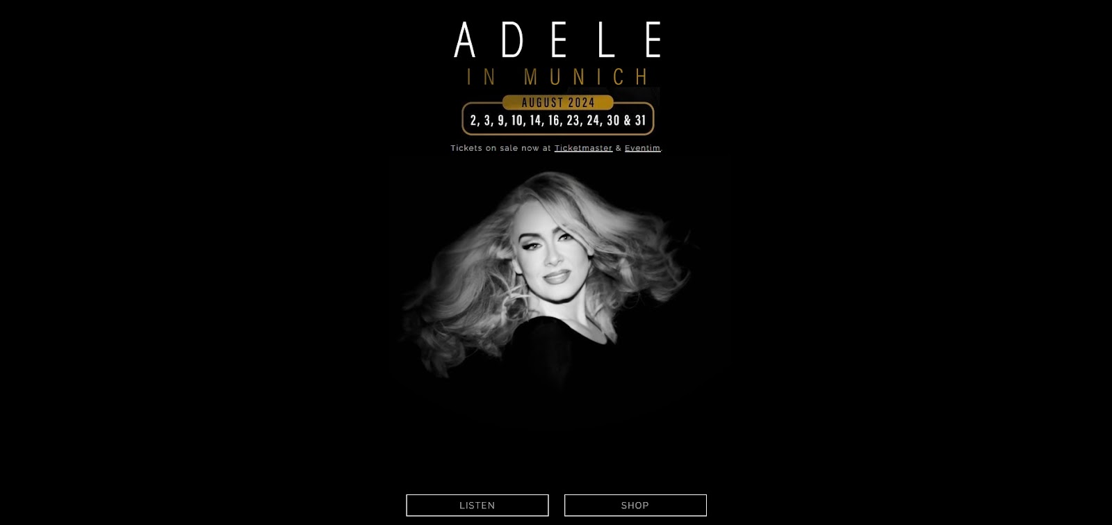
Adele’s official website has only one page, which only goes to show that sometimes less is truly more. The homepage features a black-and-white photo of the famous singer as a background image, as well as important external links that lead to streaming sites, as well as tickets and merch stores neatly packed in simple black-and-white CTA buttons.
What’s more, fans who visit Adele’s website can also easily locate all of the social media handles, where they can follow their favorite singer and stay up-to-date on all of the latest updates.
Best feature: At the bottom of the website, there is a personal message from Adele, which makes the whole website feel more intimate and fan-oriented.
Potential downside: The homepage features a flashing slideshow of the singer’s photos, which some visitors (especially those with flashing image sensitivity) may find bothersome or unappealing.
2. Billie Eilish
What sets Billie Eilish’s website apart is the background image that features the cover of her latest album. With a simple design that incorporates a truly unique combination of cool-toned hues, the website feels serene and inviting.
The email subscription service, as well as the “Collection” section, are easy to find, which enables visitors to stay up to date with all of the latest goings-on or purchase a variety of merchandise directly from her website.
Best feature: Visitors can listen to the artist’s music without having to leave the website, thanks to an embedded YouTube player.
Potential downside: Although concert and tour information are featured on the website, they are a bit more difficult to find, as the majority of the homepage is centered around promoting the artist’s music, as well as various apparel, fragrance and collab products.
3. Black Signal
According to Semrush, website visitors form their first impression about a website in only seven seconds. [1] So, using a striking image, such as the one featured on Black Signal’s website, is a great way to instantly grab attention and make your visitors more interested in browsing your website.
When choosing an image, however, make sure that it’s not just striking but that it also reflects your brand and personal style. That way, your fans can quickly gauge what they can expect from your music and you as an artist.
Best feature: Colors and hues used throughout the website fit great with the type of music the artist creates, exuding vibrancy and eclecticism.
Potential downside: Although the design is simple yet effective, there is quite a bit of empty space.
4. Bruno Mars
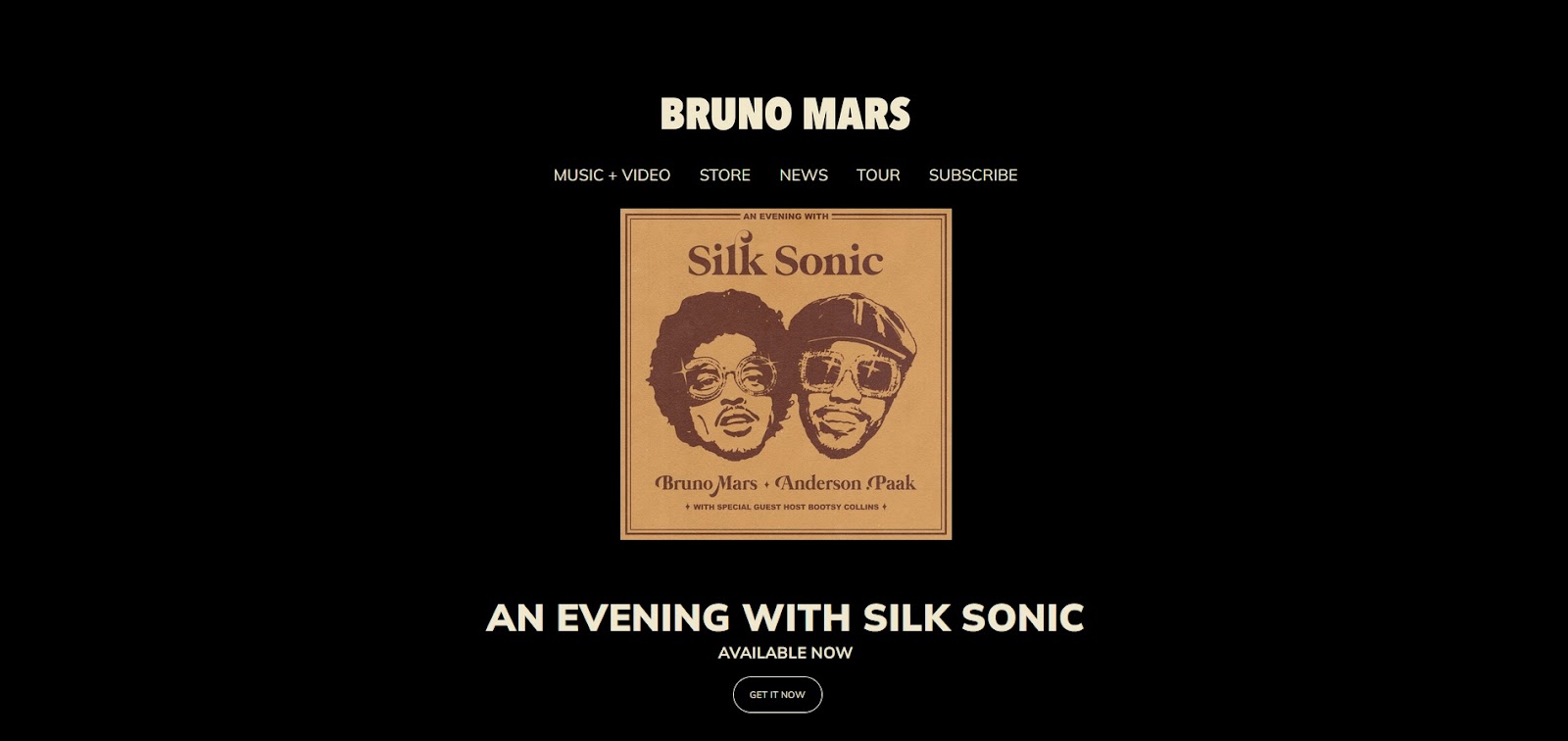
Bruno Mars’ official website features a simple design that allows visitors to learn more about the artist and his latest projects, as well as browse the merchandise. Moreover, with simple but well-placed CTA buttons and easy-to-find sections, visitors can easily listen to Bruno’s music, browse videos, check out the artist’s store or learn more about the upcoming tours.
Best feature: Dynamic and bold elements of the website perfectly reflect the artist’s energy, which is showcased not only on his website but also in his music.
Potential downside: Although included in the website homepage, social media handles are located at the very bottom of the page, which makes them somewhat tricky to locate and easy to miss.
5. Carly Rae Jepsen
Carly Rae Jepsen’s official website is another great example of a clean and simple music website design. Although quite simple, the website instantly engages the audience with a carousel of two images promoting her new album and latest single. A well-designed banner features all the necessary information any visitor may be after.
Best feature: If you go to the “Video” section, you can easily access the artist’s videos thanks to the embedded YouTube button, which can be accessed by simply hovering your mouse over any of the featured video stills.
Potential downside: The button that enables fans to get notified when new events are announced in their area is “hidden” behind a few clicks. It would be better if it was also featured on the homepage.
6. Caveboy
Caveboy’s website uses subtle animation very effectively, with the artist’s name, CTA buttons and main menu slowly appearing over the banner image as the site loads. The vintage-feeling artistic image of the band and soft hues make any visitor feel calm and welcome, while the clear menu allows them to find any information they may be after without much hustle.
Best feature: Minimal animation creates a memorable user experience, and featured testimonials speak volumes about the band, showcasing just some of the reasons why they boast the popularity that they do.
Potential downside: Although the banner of the website is quite effective and eye-catching, the rest of the homepage seems inconsistent with the rest of the design. It would be better if the overall design featured the same hues present in the banner image.
7. Eminem
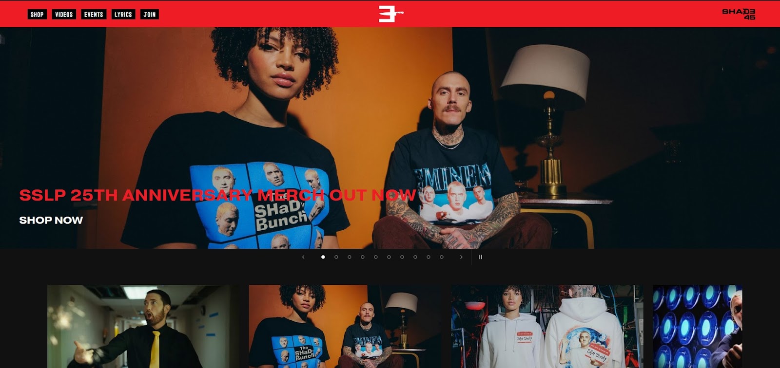
An artist who needs no introduction, Eminem, has gone over many music web design looks over the years. However, his current layout is arguably also the most effective one. One thing that sets this website apart is the fact that Eminem chose to feature all of his lyrics right there on the website, which is not something many artists do.
Simply put, with bold visuals, an effective predominantly red and black color scheme, and a slideshow, the website creates a sense of drama and intrigue, keeping the visitors engaged right off the bat.
Best feature: Aiming at nostalgia, the artist offers exclusive, vintage merch reissues on his website, which appeals to both old and new fans alike.
Potential downside: Some visitors can find the overall website color scheme and visuals somewhat aggressive, as the color red is often associated with heightened passion, which some may interpret as aggression.
8. Ghost Girl
Ghost Girl’s website smartly uses whitespace to put special emphasis on featured content. The minimalist design of the site creates a sense of sophistication, which perfectly reflects the singer’s personality and vibe.
Best feature: The website is brimming with information about the artist, pricing and all of the additional services offered, as well as contributing artists.
Potential downside: Although minimalistic in some aspects, the design does feel somewhat “busy,” so some visitors may find it difficult or confusing to navigate.
9. Haviah Mighty
Haviah Mighty’s website displays the perfect use of CTA buttons that encourage any fans who land on the page to stick around and interact with the artist’s website. What’s more, a simple yet effective background image of the singer’s face instantly captures attention, enticing visitors to keep browsing.
Best feature: Well-placed CTA buttons draw attention to key information, such as upcoming single releases, new videos, album pre-orders, and the fan subscription service.
Potential downside: The “Latest Tracks” section of the website has its own scroll-down menu, which can take over scrolling precedent. This feature can be somewhat frustrating to mobile users.
10. Maroon 5
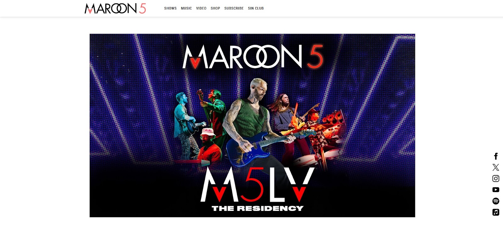
This American pop-rock band from Los Angeles, California, is well known for its dynamic, signature sound, catchy melodies and thought-provoking lyrics. Needless to say, it’s no surprise then that their site perfectly reflects the overall vibe of the band.
Although the design features the band’s various social media handles, it’s obvious that they consider Instagram the most important one, as they’ve chosen to include a grid of the band’s Instagram posts right there on their homepage.
Best feature: Modern website design and easy navigation offer visitors a seamless experience where they can choose the language in which they wish the website to be displayed, as well as learn all of the details about upcoming shows in their “Tour” section.
Potential downside: When you scroll all the way down to the very bottom of the website’s homepage, the footer of the website covers up two of the six social media handles.
11. Mitski
The heavily-artistic design featured on Mitski’s official website homepage perfectly reflects the singer’s overall style. The website is designed in a way that encourages the visitors to scroll around in search of information, which significantly boosts engagement and peaks curiosity.
Best feature: The clean yet eclectic look keeps visitors interested in learning more about the artist, their work, as well as the upcoming shows. The “Join Waitlist” option in the “Upcoming Tour Dates” section of the homepage evokes feelings of exclusiveness and FOMO (fear of missing out), which many modern fans seem to enjoy.
Potential downside: The newsletter bar is set at the very bottom of the website, which makes it easy to miss.
12. OCEANDVST
Arguably, one of the easiest ways to have your brand identity displayed front and center on your music website is to use a high-quality image of band members as the main background. As soon as the visitors land on the page, they’re met with a photo of OCEANDVST members against a striking purple background.
Moreover, once they start scrolling down, the image becomes translucent, and an overlay of various options and additional information takes center stage.
Best feature: The band’s striking logo that’s present throughout the website will return visitors to the main homepage once clicked, which makes browsing super effortless.
Potential downside: With such a visually engaging background and an overlay that doesn’t feature a distinct section background, it may be somewhat difficult to read the content featured on the website.
13. Omar Apollo

Not only strikingly handsome but also extremely talented, Omar Apollo seems like he really knows what he’s doing by choosing to make a sultry photo of himself, which is the main visual element of his website. This eye-catching imagery instantly grabs the attention of any visitor, encouraging them to browse the site further and, thus, further engage with the artist himself.
Best feature: Relevant information is displayed clearly, and the homepage doesn’t feel overwhelming or super “busy.”
Potential downside: As visitors click through different website sections, they are being redirected to other sites related to Omar, like his YouTube channel, which can make the browsing experience somewhat frustrating, especially if done via mobile.
14. Rihanna
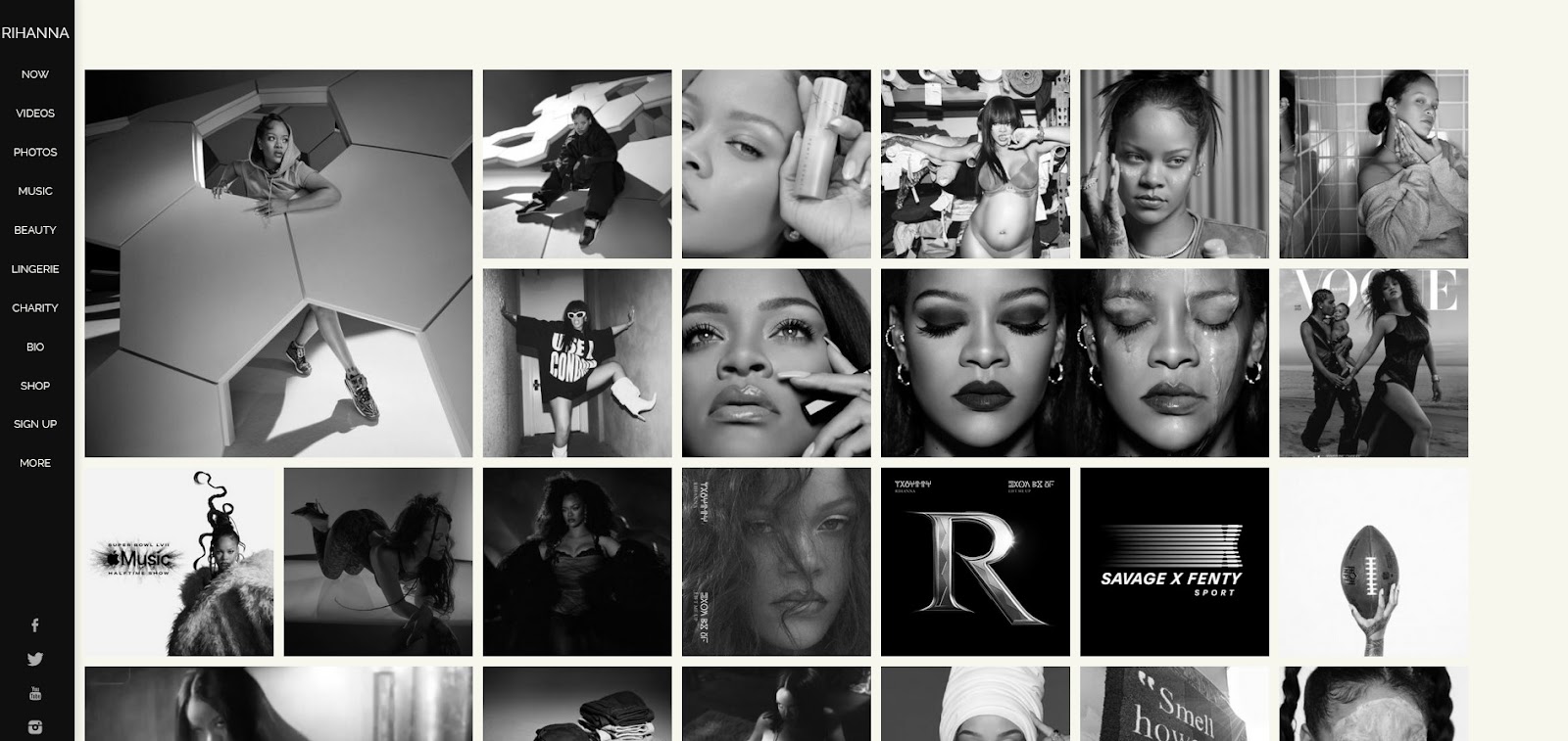
Another singer who really needs no introduction, Rihanna, is a Barbadian beauty who has made a name for herself in the music, acting and business industries. Her website greets visitors with breathtaking, artistic imagery of the artist as soon as they land on the homepage, with a sidebar menu located on the left-hand side that grants quick and easy access to all other sections.
Best feature: A grid of images depicting the artist’s various events, projects and music endeavors is further enhanced by the option to click on any of the images, which then presents the visitors with additional information.
Potential downside: Some of the website sections showcased on the left take visitors to separate pages that are a bit slower to load, while others simply “jump” to another website page.
15. Swiss Portrait
Swiss Portrait’s website is designed to remind visitors of the early internet and, as such, creates a sense of nostalgia many visitors simply can’t resist. To this end, located at the very bottom left corner of the website is a button that resembles an early “Windows” start button, through which visitors can access sections like “Gigs,” “Videos,” “Merch,” “Contact” and even “Solitaire.”
Best feature: In our humble opinion, the best feature of the website is the “Solitaire” button, which allows fans to play a round of this ever-so-popular game. This casual approach, and the fact that the website doesn’t only encourage users to take action in terms of “buy” but also have fun, is certainly very welcome.
Potential downside: The “Start” button should be a bit bigger so that it’s more easily noticeable.
How to Create and Design Your Music Website
Get Inspired
Creating and designing a good music website is not much different than the process of making music. So, start off by brainstorming about what you wish your website to look like, and note down all of the features you wish to incorporate in the final look.
Decide on how you wish to display your visuals, choose which elements you’d want to highlight – like tour dates, new merch drops and latest album/single releases – and display information about where your fans can find and follow you.
Choose the Right Place to Host Your Website
When choosing the right platform to host your website, you need to ensure that you choose a hosting provider that will be able to cater to all of your wishes and don’t be afraid to speak up or even switch providers in case you’re not entirely happy with the service.
Find a Theme and Template That Suit You Best and Customize Them
When building a music website, you can take some weight off your shoulders and browse pre-made themes and templates which you can easily customize later on. Ideally, look for a solution that has:
- The option to add clickable social media links. But, when doing so, try not to have your website footer “float” over the social media handles (like we had a chance to see in one of the designs mentioned). Rather, look for themes that offer some of the best website footer design solutions and go from there.
- Featured CTAs that will allow your visitors to access your music from every page of your website.
- The option to include a section for buying tickets or reserving specific concert seats.
- An option to add multiple and interactable areas for location and contact information.
- Features that allow you to choose between incorporating image, video or slideshow backgrounds.
Enable Visitors to Make Purchases Directly From Your Website
Since selling your music, concert tickets and merch is a big part of your business, you also want your website to be the place where your fans go to make these various purchases. Therefore, make sure that you enable them to do so right from the comfort of your website by adding various ecommerce plug-ins and different payment processing options.
Remember that the more comfortable your visitors feel with purchasing from your website, the more they’ll be inclined to do so.
What We’ve Learned So Far
Considering everything discussed previously, it becomes clear that singers who not only wish to engage fans and attract new audiences but also impress peers and other industry professionals need to have a good music website to fall back on.
That being said, here are just some of the key music website features you should keep in mind when designing your page:
- Use visually engaging images to quickly grab attention and encourage visitors to stay on your website.
- Utilize whitespace to emphasize content, but make sure you don’t “overdo” it to avoid having your website look “empty” and “unfinished.”
- Go with a video header to boost interest, but make sure it’s optimized properly to avoid ending up with a slow-loading website.
- Website animations should be used carefully, as many people nowadays access websites through their mobile devices, and this feature can greatly compromise their browsing experience if not done right. If you opt to include website animations on your page, learn everything you need to know about mobile-first website design to ensure that everything goes smoothly.
- Your music website should also feature a space where you can sell your music and merch, but avoid making it the first thing your visitors will see once they land on your page. Otherwise, you run the risk of making them feel like you’re only interested in their money.
- Make sure you coordinate the color palette used on your website with your personal style, the vibe of your music and your brand.
- Use call-to-action buttons whenever and wherever possible, but don’t make them overwhelming. Aim at making them feel and come off as the natural next step to take instead of having them come off as too aggressive or pushy.
- Make your personal brand the main focus of your music website design to emphasize individuality and relatability.
- Use pops of bright color to capture attention, but only if they align with your brand, style and vibe.
- Make your website exude structure and style by carefully planning out navigation and insisting on user and mobile-friendliness.
- With the help of careful branding and a striking logo, you can easily make your music website stand out from the crowd. If you don’t already have one, you can easily create a logo for your brand and thus fortify your brand identity by using a reliable logo-making tool.
- Oversized typography can also make your website design pop by instantly letting your visitors know who you are, what you’re about and what they can expect from your music. It will also make you more easily recognizable as an artist, which will certainly help you stand out.
- You can also choose to use abstract imagery on your website to set a mood, but be careful not to go too over the top and end up confusing your visitors instead of getting them interested in your website and music.
- Last but not least, add a sidebar menu to your website to add more structure and make navigation more easy and seamless.
Let HostPapa Help You Out
At the end of the day, building a good music website is not something anyone should do on a whim. Rather, it’s best to rely on established industry professionals like HostPapa to do it for you, if you don’t feel like you have the necessary skills.
With a plethora of web hosting services, a user-friendly website builder and a Do-It-For-Me service, you can easily let us build your new website for you and put all of your worries to rest.
So, don’t hesitate to get started with HostPapa today and see how we can help you build an amazing music website.
Frequently Asked Questions
What Is the Purpose of Having a Music Website?
A well-crafted and designed music website can be the perfect tool to help musicians build their brand, enhance their exposure and generate income. What’s more, it’s the perfect place to promote their business, keep their fans in the loop with all of the upcoming events and connect with their fanbase on a more personal level.
Can Having a Website for Your Music Help You Grow as an Artist?
Since a personal website serves as an artist’s central hub for online presence, it can absolutely help them grow. Not only will a personal website help the artist’s fans learn more about them and their work, but it can also serve as a great portfolio when looking for new business opportunities.
Do Fans Visit Musician Websites and Why?
With social media and various streaming services available to fans nowadays, it may seem like musician websites are no longer as popular as they used to be. However, this can’t be further from the truth as fans still wish to stay updated with all of the latest goings-on, and not all of them are present on social media platforms.
