Why do you build a website, write an email, or create a marketing campaign of any kind, really?
It’s because you want to accomplish a certain goal.
That goal can be anything. Maybe, you want to get an audience that’ll read your content or watch your videos. Maybe, you want customers that will buy your products or services. Or something else entirely.
The point is this:
When you create a website, or write an email, or do any kind of online marketing activity, you want people to respond to it in a specific way, so you can get closer to achieving your goal for the website.
To make that happen, you need CTAs (Call-To-Action). In this article, we’ll show you how to create beautiful, well optimized and well-placed CTAs on your website or on any piece of marketing content.
But first, here’s a short intro to what CTAs are and why they are important.
What CTAs Do: A Brief Explanation
Here’s the thing:
Unless you explicitly tell your website visitors what you want them to do when they are interacting with a piece of your content, it is likely they won’t do what you intended.
If you want to increase the conversions on your website or other marketing copy, it is necessary to tell your visitors what is the next step they should take when they are reading your content.
Here’s an example:
Let’s say you have an online shop. You want people visiting your website to buy as many of your products as possible. To make that happen, you need to add a ‘buy now’ button next to it.
Similarly, let’s say you want people to subscribe to your newsletter. You’ll have to add a ‘subscribe now’ button that will nudge your visitors to do just that.
The button that guides the users towards the next action is called a CTA (Call-to-Action).
Image credit: Stevens & Tate
Three Rules for Creating a CTA Button
These rules are more of general guidelines. But if you’re new to CTAs, these guidelines will help get you on the right track and avoid common mistakes which cost both time and money.
The three rules for creating CTAs are:
1. Make Your CTAs Well Designed: You want your CTAs to stand out and demand attention from the people looking at it. That’s why it’s important to make them look different from the rest of the buttons on your website.
2. Place Your CTAs Prominently: It’s no use if your CTAs are hidden away somewhere on your website. That’s kind of the same as not having CTAs at all. Instead, you want them to be placed as prominently as possible.
3. Have Great Copy in Your CTAs: The last, but arguably most important rule, when it comes to creating great CTAs is that they need to have great copy. Generic text doesn’t inspire people to click on CTAs whereas great copy definitely does.
You can look at these three rules as ‘checklists’ you needs to tick off in order to create visually (and emotionally) appealing CTAs.
Now let’s take a deeper look into each of these rules so you can execute them as effectively as possible.
Rule # 1: Make Your CTAs Well Designed
Nobody wants to click ugly buttons. They look shady and are likely to make people think it will give their computer a virus.
Here are some tips you can use to improve the design of your CTAs:
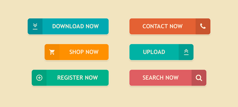
1. Make it look clickable: CTA, no matter what it does, is activated when a person clicks on it. That’s why it’s important your CTA looks clickable. You can do that by simply placing your CTA inside a rectangle of sorts to make it look like a button.
In addition, you can customize it by adding special effects, such as shadows, gradients, hover animations, and more. The point of this is to make your CTA look as clickable as possible.
Image credit: econsultancy
2. Add a lot of whitespace around it: Your CTA button should stand out from the rest of the elements on your website, including text, images and other buttons.
To do that, you should add more whitespace around your CTA than other elements. This will have the positive effect of giving it more emphasis and prominence, which is important if you want more people to pay attention at it.
3. Make it clear and bold: A CTA button should be easy to find. To do that, make sure it has a contrasting color to your website’s background.
Another strategy that can make your CTAs clearer is by muting the colors of other buttons on your website while giving your CTA button a popping color. Remember to make sure that the color you decide to use compliments the overall look of your website.
4. Make it bigger: The size of your CTA button will also play a big role on how effective it is at capturing your visitors’ attention. The bigger the size, the more attention it will get.
That’s a rule you can play around when designing your CTA button. But be warned: don’t make your CTA button too big that it alienates your visitors. Just make it a bit bigger than other buttons on your website.
When you start designing CTA buttons, your goal shouldn’t be only to make them look beautiful. Rather, you should make them look prominent and clickable.
After that, you can make design changes, such as adding gradients, rounding off the corners, adding logos, and similar effects which will help beautify your CTAs.
Rule # 2: Place Your CTAs Prominently
The next question you need to ask after designing CTAs is where will you place them? Because strategically placing your CTAs in the right location on your website has a dramatic chance of improving the conversion rate it gets.
Generally, there are two main locations where you can place your CTAs:
1. Above the fold: The area of your website visible to your visitors first before they need to scroll is called ‘above the fold’. Since 100% of your visitors see this part of your website, many marketers and designers prefer putting a CTA button in this location.
2. Below the fold: This part of the website becomes visible when a person scrolls down the page. You can place your secondary CTAs there, or repeat the same CTA you placed above the fold.
Both of these locations have their own advantages and disadvantages.
The advantage of placing your CTA button above the fold is that it gets viewed a lot more times.
However, if you’re selling a complicated product, or want your visitors to take an action that requires a lot of investment on their part, placing your CTA above the fold might not be a wise move.
In this case, it’s better if you place high quality, persuasive web copy there which convinces your visitors of the products / services you’re selling. Then, place the CTA firmly below the fold where only the people who actually read your web copy will see it.
However, if you’re selling more high turnover items, then you can place your CTAs at a prominent position on your website above the fold. There it will be easier for your visitors to become aware of (and quickly take) the next step.
The ‘F’ Pattern
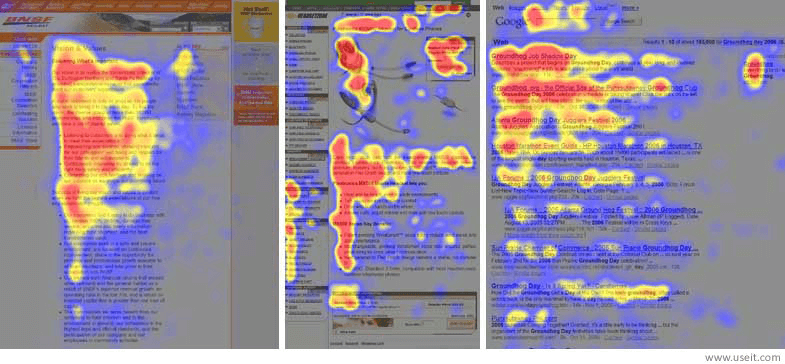
An extremely famous study by Nielsen & Norman did a survey on how people look at websites on the internet. They found that most internet users eyes move across a website in a ‘F’ pattern.
You can see this from the image above which shows the heatmaps of how users looked at three webpages on the internet.
You can use this information for strategically placing your CTAs in the right location where most people will be able to notice them.
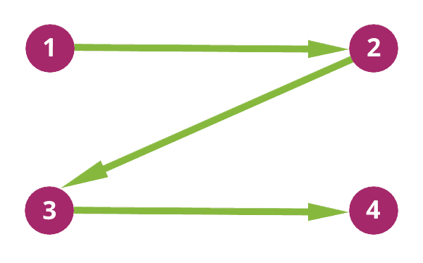
Based on the image below, if you are placing your CTA above the fold, it would be a good idea to do it according to a ‘Z’ pattern, which is how most people’s eyes move when looking above the fold.
Image Credit: Wordstream
However, if you decide to place your CTA below the fold, it might be a good idea to place it on the left part of your website, because that’s where a person’s eye naturally falls if they are quickly scanning through your website.
Rule # 3: Have Great Copy in Your CTAs
Placement, positioning, looks – none of this matter if your CTA doesn’t have good copy in it. Most website owners make the mistake of ignoring the quality of copy in their CTA buttons, instead focusing strictly on the general website copy.
While there is absolutely no denying that website copy is important, the CTA copy is important just as much.
You should try to make your CTA buttons convey the benefit the users can expect when they click on it. Or, if that’s not possible, the least you can do is make the text in it sound more human.
Here are a few ways you can do that:
1. Have Your CTAs Say the Exact Action Along with the Perceived Benefit: For example, ‘Start your free trial’, ‘Subscribe to receive your instructional PDF’, etc. These hyper-customized CTA buttons clearly show what actions your visitors need to take in order to get access to the benefit.
2. Replace Generic Copy with Something Different: If you run an online store, nearly all of your CTAs will require people to ‘buy now’.
In order to shake things up and try something original, you can say ‘Get it now’ or ‘Let’s do it’ if applicable. This less used copy might resonate more with your visitors and be more effective at convincing them to act on your CTAs.
Remember to constantly test the CTA copy to see which version will get you the most clicks.
3. Avoid Words That Ask Users to Do Something: This may sound counter-intuitive, but bear with us. Nobody likes to do things like ‘Click here to purchase’ or ‘Enter your email’, etc. It just isn’t attractive.
What people do like is to ‘Get premium access’ or ‘Discover new products’. You should avoid words that focus on making people do things and instead focus on words which show them what they can get by clicking on the CTA.
While following these tips, it’s important to keep in mind not to make your CTA copy too long or too complicated. The copy within your CTA button is intended to quickly send a persuasive message to your website visitors.
If it’s complicated, your visitors might get overwhelmed or suffer from decision fatigue as they try to process your CTA copy.
So keep it simple, but also persuasive and memorable. That’s the whole point of your CTA copy!
Image credit: The Startup
Last But Not Least…
A great way to figure out what’s working for you is to A/B test you CTAs.
CTAs are an extremely crucial part of your website copy and everything about them should be tested, whether it’s the design, the placement, or the copy.
With the data you get from your tests, you’ll be able to accurately decide what works best for improving the conversion rate of the CTAs on your website.
Do you take the time to work on your CTAs and test them? Did you come across any interesting findings?


