Everywhere you go, you see all sorts of branding. From the car you drive to work, up to your neighbourhood’s marketplace, and inside the supermarket. That branding comes not only from a good product but also from using a great logo.
A logo is more than just eye candy to make you pick one brand over another. It’s the brand’s essence, and a lot of work is being put into making a great logo. This HostPapa blog post explores everything around logo branding and why a great logo can transform your business.
- Why Is a Logo Important?
- What Does a Logo Stand For?
- Guidelines for a Great Logo
- Learn All About the Different Logo File Types
- Visual Elements and Tips
- Should You Create a Logo Yourself?
Why Is a Logo Important?
First and foremost, you need to grab your audience’s attention because, in turn, they might eventually buy your products.
Nothing beats a solid first impression made by an attractive logo. After the first impression, which should reflect your company’s goals and attitude, your audience digs deeper to find out more about your brand, building brand loyalty. People who love the products you sell will not only return, but they’ll also tell their friends about you. That’s a trust level you can create with the help of a great logo.
A logo different from the competition will boost your brand’s awareness and be memorable. Imagine walking down the street, looking at the houses. If one home has an architecturally unique design, you’ll most likely remember it for the rest of the day and maybe even tell your friends and family. That’s how a great logo can help you differentiate yourself from your competitors.
These are why a logo is important, so continue reading – we go through some great tips on what makes an excellent logo and why your business needs one!
What Does a Logo Stand For?
The essential purpose of a logo is to represent the company. A logo acts as an introduction to your brand, a symbol if you like, allowing people to get to know what you do.
A logo must convey the company’s purpose and create a bond with the audience. Remember, the logo does a heavy job bringing you your first customers, so put some extra thought into it when embarking on this adventure.
Guidelines for a Great Logo
Now, let’s get to the fun part. Three significant components come into play to make a great logo: Colour, Typography, and Image/Design. The first two define your brand or company, while the third blends everything and completes your logo to make it ready for the public.
Stand Out From Your Competitors
As a business owner, you need to know the market inside out. Looking at the competition can give you excellent insight into where to focus, what to avoid and what to improve when thinking of your company’s logo.
Be unique so you can make a dent in the competition. Try something new and refreshing while keeping yourself in the realm of your industry.
Make it Memorable
Creating a logo that will stick in the minds of your customers is often overlooked. Standing out from the crowd is one thing, but creating a memorable logo that everyone will connect with is another. This can work along with the other tip right above.
A memorable logo is often easy to draw or recall from memory, with a clear font, a simple design element, and colours representing your brand. Examples are the Nike, Adidas, and Apple logos. They all have something unique and bold, yet you can probably draw them on paper.
Nike and Adidas play around with their logo on products like sneakers and clothing. If your business can, bring multiple colours into play and your products to strengthen your branding.
Simplicity Works Best
An excellent logo is very often a straightforward one. A word with a clean font or an icon can be a starting point for success. We live in a time-crunched world, and you want your audience to understand and remember your brand through a simple logo quickly.
Make it Easy to Adapt Everywhere
Another thing your logo must have is versatility and the ability to adapt everywhere. Again, we can take as an example Nike’s sneakers. Their logo sits on every pair they sell, yet they find ways to incorporate it into different designs.
This is exactly what your logo must do. Starbucks is another company that uses the same logo on their stores and coffee cups; it just works!
A circular logo, like the one from Starbucks, is pleasing to the eye. Our minds can process this particular shape better and faster, so ask for a circular logo mockup when creating one for your business.
Learn All About the Different Logo File Types
Whether you created your own logo or hired a designer to do that for you, you have some files on your computer’s desktop.

File types distinguish one file from another. For example, a JPG is an image file, but so is a PNG file. Your computer can read them, but they’re suited for different applications. JPG is best suited for photographs you took on vacation, while PNG can store a high-quality poster from your favourite football player.
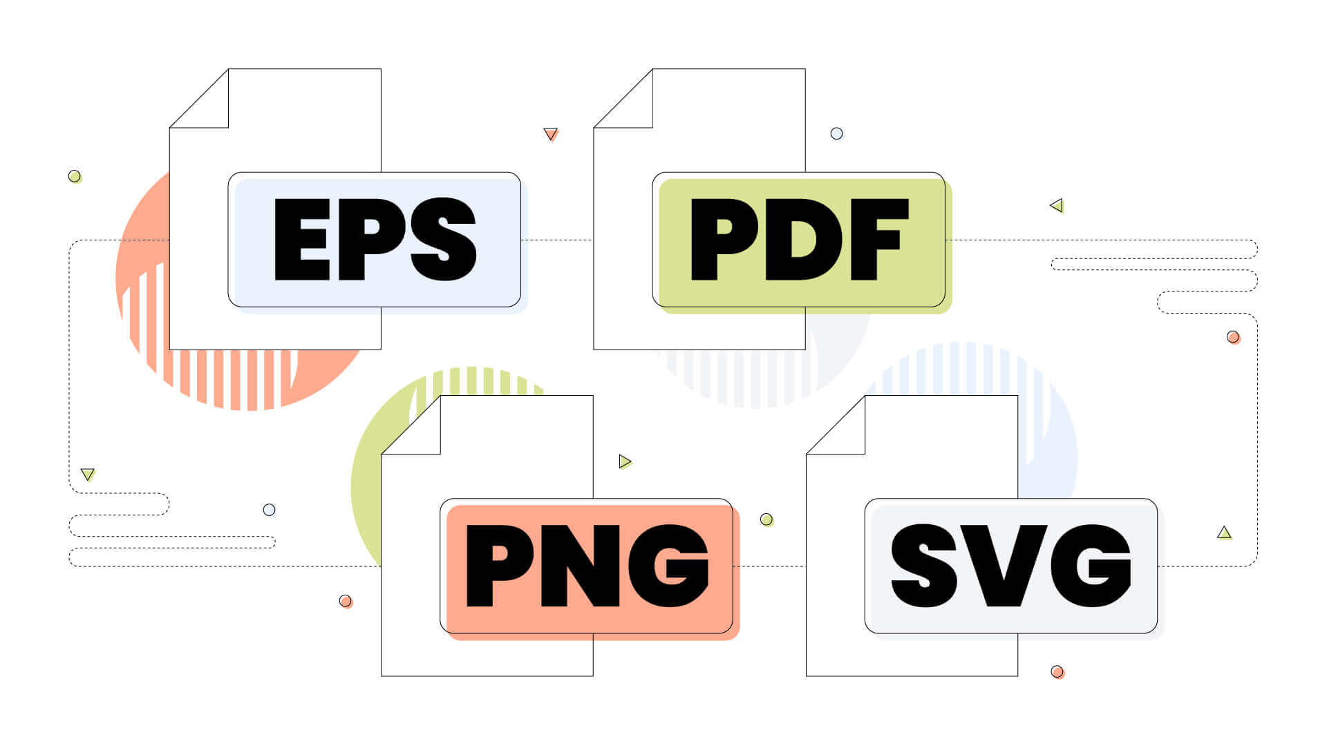
The same happens with logos. There are plenty of file types a logo can come in. Most of these are:
- EPS: An Encapsulated PostScript is a file format that Adobe Illustrator uses to save a working file. This file type is also editable in Adobe Photoshop. EPS can be used to store logos and as a printing source for large-scale prints, postcards, business cards and many more.
- PDF: Another file format from Adobe is widely used today for all digital documents, e-books etc. Many designers deliver their logos and other material in PDFs that enclose a small presentation. Both Illustrator and Photoshop are capable of reading and exporting PDF files.
- PNG: A Portable Network Graphic is a file format that uses web-friendly compression, supports transparent backgrounds, and it’s suited for websites and printing purposes.
- SVG: A Scalable Vector Graphic file that has no resolution and supports transparent backgrounds. SVG sizes are much smaller than PNG and JPG, and they’re popular among web designers, web developers and graphic designers. They can scale to whatever size you wish without affecting their quality, and they’re also used for web applications.
Visual Elements and Tips
With almost endless design elements that you can use for your logo, there are some golden standards you can follow to build an eye-catching logo. Some visual elements are colour, typography and the arrangement of these two.
Logo Typography
Finding a good font might take forever, but rest assured that there are fonts for every application.
Each font conveys a different message to the audience, and some fonts are suited for various applications and businesses. For example, a traditional font is more suited for a museum or an art gallery, whereas a modern font is more suitable for a nightclub or a computer store.
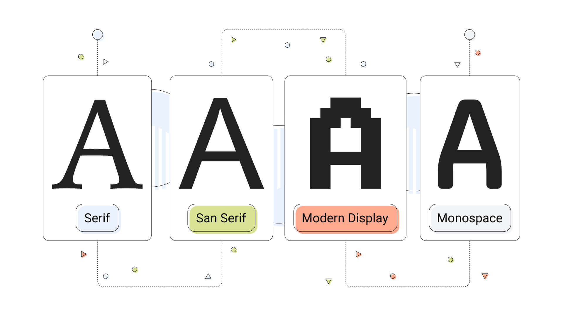
We could split fonts into four main categories.
- Serif: Fonts that convey a more authoritative and mature stance. Serif means that these fonts have small lines on the edges of letters. Popular fonts in this category include Times New Roman and Georgia.
- Sans Serif: The word Sans means without, so these fonts lack the small lines on the edges of letters. These are modern and primarily neutral fonts that can be used anywhere. Examples are Arial, Calibri and Verdana.
- Modern Display: These are considered coarse and bold, masculine fonts in the sense that they are “heavy” on their own. The Impact and Rockwell fonts are popular examples, mainly used for big text-like article titles.
- Monospace: These look like they came from a typewriter and are more suitable for computer-related projects.

What Colours Should You Use on Your Logo?
Colours are emotions, and using them as a communication tool is genius! You can pick the ones that best describe your business with colours bound to specific emotions. Darker colours, like deeper shades of purple or black, tend to depress people.
Pastel colours, for example, are calming and can create a welcoming effect for visitors. Pastel colours are an excellent choice for your business if you have an ice cream shop.
Two popular tools to check for colour combinations are:
Logo Visual Arrangement
You must arrange your typography, shapes, and all the design elements nicely, or your logo won’t do its job. Proper framing and making room for every element are crucial steps to transfer your message more clearly.
Clever Use of White Space
An ordinary colour like white can be used cleverly to present a logo that can be readable in any format. A blank space, also known as negative space, can bring balance to your logo and make it breathe, especially when busy elements come into play.
Should You Create a Logo Yourself?
While many will tell you not to, you can certainly try. If you have no experience at all, you can experiment but leave the design process to a trained professional who can give you better results to work with.
When working with a designer, communicate your vision so they can understand your business model and approach it correctly. It’s imperative that they can see your vision as well as you do.


