Now that you’ve got yourself a great website, the next step is to organize and structure your webpages so they look fantastic. To help you, HostPapa provides Layouts to make your content look accessible and entertaining. Layouts is part of the Website Builder and has an easy-to-use drag-and-drop system.
To learn how to access your Website Builder to get started, please visit this article.
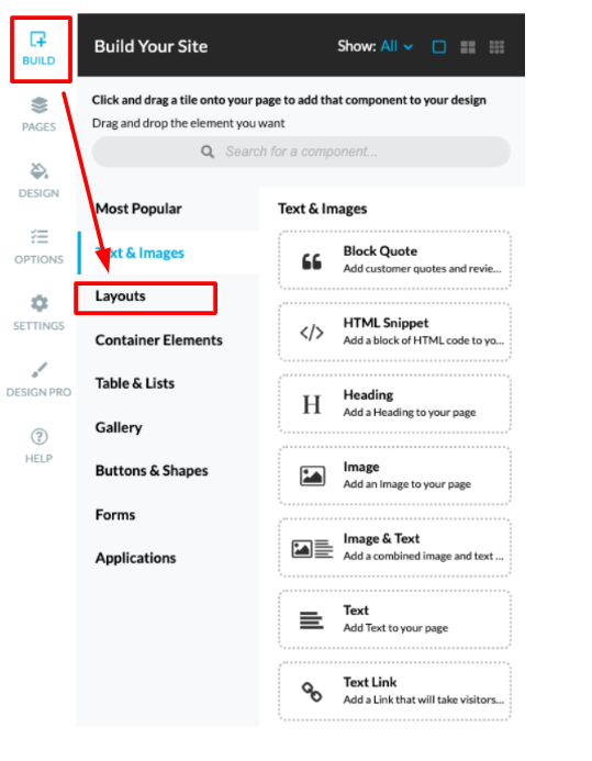
To begin using Layouts
- Move your cursor to the menu on the left of your screen.
- Select the first option, which is the Build tab.
- Choose the Layouts option from the drop-down menu.
Getting to grips with Layouts
To shape your content to entice visitors to your webpages, Layouts allows you to create multiple content areas. They are separate from each other, but will be displayed together on your webpage at the same time.
The content areas can accommodate a large amount of detail in a limited space. Content areas are also known as containers.
These containers are created using:
- Rows
- Collapsible rows
- Columns
- Tabs
- Vertical tabs
- Accordions
There could be sections of your webpage that don’t need to be shown to the visitor unless they select an option to do so. Layouts can conceal information as you require.
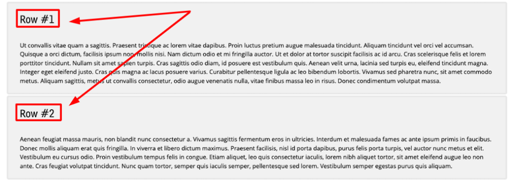
What are rows?
Rows hold content areas, and they can be stacked on top of one another vertically.
What are collapsible rows?
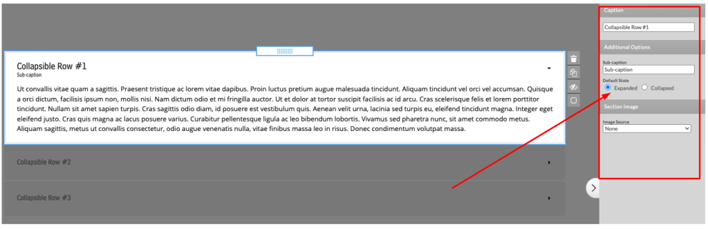
Using collapsible rows means that your rows can expand or even collapse, and they will do so with an animation effect. To access the option for collapsible rows, please:
- Move your cursor to the menu on the left of your screen.
- Select the first option, which is the Build tab.
- Choose the Layouts option from the drop-down menu.
- Click on the second option on the next menu, which is Collapsible Rows.
You can now choose to expand or collapse your row
- Place your cursor in the Caption field to give your row a name.
- Enter the cursor, next, into the Sub-caption field, which is in the Additional Options section. In the Sub-caption field, you can add a subheading or H2, as it’s also known.
- Decide if you want the new row to expand or collapse by checking the radio button on either the Expanded or Collapsed option.
- Add an image by clicking on the Image Source drop-down menu.
Make sections of your webpages stand out with Columns
Columns help you create horizontal content areas that are open. They are best used for introduction sections and can help fill up the space on your page if the amount of content is limited.
The options in Columns include:
- Display section headers: Here, you can decide if there will be a caption.
- Display section delimiters: This allows you to create boundaries between columns.
- Distribute width equally across columns: With this option, the width of the column will be consistent, regardless of the content you are using.
- Equalize height of column content panels: The height of the column content panels depends on the amount of content within them. Using this option will equalize the heights of the columns.
Using Tabs to make your content fit the space
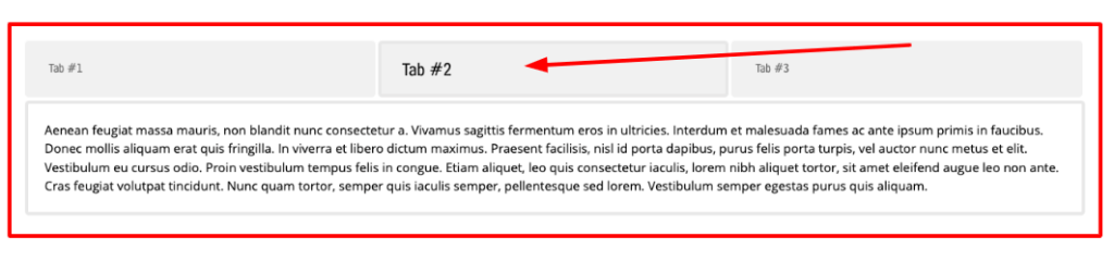
If you find yourself struggling to fit your content in a small area, Tabs can be of great benefit to you.
To get to the Tabs button:
- Move your cursor to the menu on the left of your screen.
- Select the first option, which is the Build tab.
- Choose the Layouts option from the drop-down menu.
- Click on the Tabs button, which is the second button from the bottom.
The Tabs group has three sections, but only one can be shown at a time. The first tab will automatically open when a webpage is loaded. You have the following preferences when setting up your tabs:
- Minimum Height in pixels: When you apply the minimum height, you will find that all of your tabs will be that height.
- Animate section transitions: As a visitor moves from tab to tab, a special transition effect will display.
- Distribute width equally across tabs: No matter how much content you use, this option will make sure your tab width will stay the same.
- Equalize height of tab content panels: Each tab is only as high as its content, but this is a default setting. This option will allow you to automatically equalize the height of your tabs.
Vertical tabs
Operating in a similar way to Tabs, Vertical tabs can help visitors keep scrolling down your webpage rather than suddenly moving left to right.
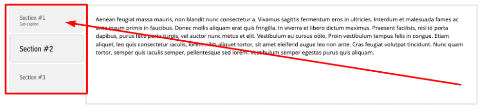
You can use most of the same options in Vertical tabs that you have in the standard Tabs.
- State the Minimum Height in pixels.
- Animate section transitions.
- Equalize the height of tab content panels.
Using Accordions
The idea of the Accordion is that it will display only one section at a time. As one section of the Accordion is opened, another will collapse with an animation effect.
To take a look at the Accordion options, please:
- Move your cursor to the menu on the left of your screen.
- Select the first option, which is the Build tab.
- Choose the Layouts option from the drop-down menu.
- Click on the Accordion button, which is the first button at the top of the next menu.
If you need help with your HostPapa account, please open a support ticket from your dashboard.