Note: This article refers to the legacy version of the Website Builder. If you signed up to the HostPapa Website Builder after March 11 2020, you’re on the new version of the Website Builder. For help, go here.
Mobile Publishing is designed to help your customers find you from anywhere and at any time. The mobile publishing functionality allows you to optimize your HostPapa Website Builder site and publish it specifically for viewing on mobile devices. We offer 3 types of mobile publishing:
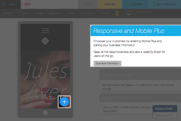
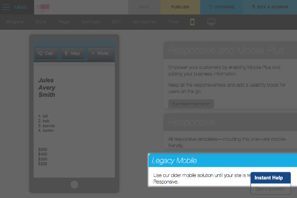
- Responsive and Mobile Plus. Empower your customers by enabling Mobile Plus, and adding your business information. Keep all the responsiveness and add a usability boost for users on the go.
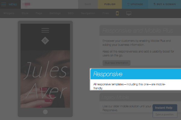
- Responsive. All responsive templates are by default mobile friendly.
- Legacy Mobile. Use our older mobile solution until your site is ready for responsive.
To access Mobile Publishing, click on the Mobile preview button located along the top of the screen.

Responsive and Mobile Plus.
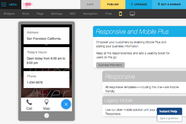
The Mobile Plus option is available for any of our Responsive templates. and is exclusively available to users of Website Builder Unlimited or higher. This adds a usability boost for users on the go, by displaying your business phone number, operating hours as well as the physical address. You can see this by clicking the + directly in the mobile preview screen.
If you don’t wish to have your business information displayed, you can switch from the Responsive and Mobile Plus option to the Responsive option.
Responsive.
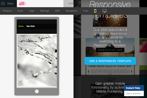
If you are not already using a Responsive Template, then you can switch to one, by selecting the Use a responsive template option displayed. All responsive templates are by default mobile friendly.
Legacy Mobile.
This type of mobile publishing is available to users of Website Builder Unlimited or higher and can be used with any template. This option hides most of your site’s template and displays a simplified version of your site to anyone visiting on a mobile device. You will have access to the following features:
- You can change your header’s background color and font, to differentiate it from your non-mobile-optimized site.
- One-touch buttons:
- You can add a button for customers to call you instantly, without having to scroll through your site.
- You can add a Map button to display a map to your business, making it easier for customers to find you.
- You can choose whether to display your site’s banner image on your mobile-optimized site.
Our Mobile Mobile publishing options are designed to help your site pass Google’s Mobile-Friendly test. Here’s how to check your site:
1. Publish your site with the responsive enhancements.
2. Go to the Mobile-Friendly Test page.
3. Enter your webpage URL (ex: mysite.com)
4. Click Analyze.
You’ll see the message “Awesome! This page is mobile-friendly.”
Please note: If you are using a non-Responsive style and do not use the Legacy mobile publishing option, your site will not pass Google’s Mobile-Friendly test.
